data visualisation
-
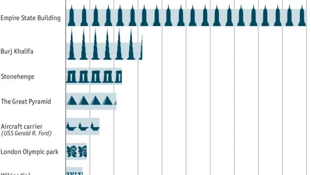
Depressing Graphic Shows Time Humanity Spent Watching Gangnam Style

The Economist made this sobering graphic of the hidden cost of the most popular YouTube video of all time — with more than two billion views since June 2012: “At 4:12 minutes, that equates to more than 140m hours, or more than 16,000 years.” Then, it was compared to some of humanity’s most monumental tasks.
-
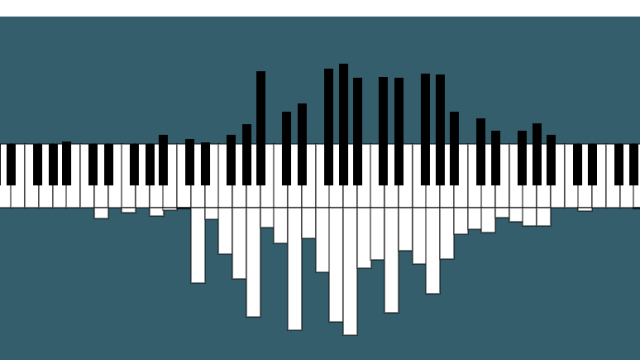
Visualising The Notes Played In Songs On A Piano-Turned-Histogram

Ever wondered how many times a certain note gets played during the course of a song? Well, this tool developed by Joey Cloud lets you visualise the number of times each note is played on a histogram — that happens to look exactly like the piano keyboard it represents.

-
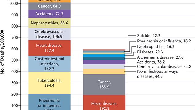
The Top 10 Causes Of Death In 1900 Vs Death In 2010
This chart by the New England Journal of Medicine compares the top causes of death in the United States in 1900 and 2010. The shift is fascinating — in little more than a century, humanity has eradicated so many diseases. Others, however, have increased, like cancer and heart disease.
-
What The Top 100 Female Porn Stars Look Like In One Fascinating Chart
Data Looks Dope’s Max Einstein sent us his new creation: What the top 100 porn stars look like. At the top you can you can see the breast cup size. At the bottom there’s the top 100 actresses as ranked in Xvideos.com along with body measuring information according Internet Adult Film Database.