visualizations
-
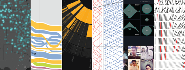
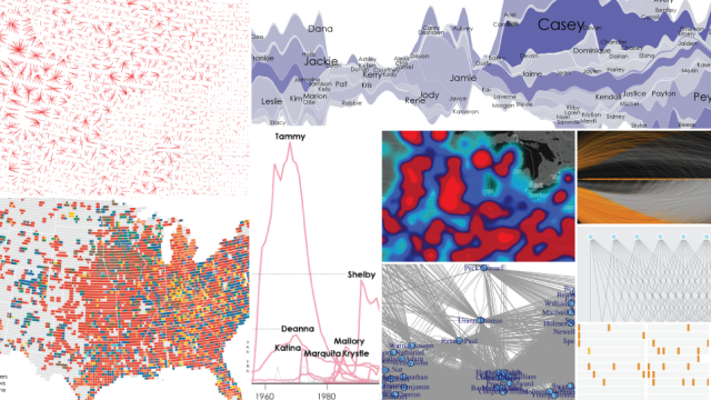
The Best Data Visualizations Of 2014

It’s always tough to pick my favourite visualisation projects. I mean, it’s a challenge to pick and rank your favourite anything, really. So much depends on what you feel like at the time, and there’s a lot of good work out there. Nevertheless, I gave it a go.
-
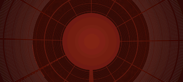
Watching 24 Hours Of Someone’s Heartbeat Is Weirdly Mesmerising
As visualizations go, this is a simple one: it simply shows the heartbeats of Jen Lowe from the last 24 hours, gently pulsing as a big, bold, red screen. And it is insanely mesmerising.
-
The Best Data Visualizations Of 2013

Visualisation continues to mature and focus more on the data first than on novel designs and size. People improved on existing forms and got better at analysis. Readerships seemed to be more ready and eager to explore more data at a time. Fewer spam graphics landed in my inbox. So all in all, 2013 was…
-
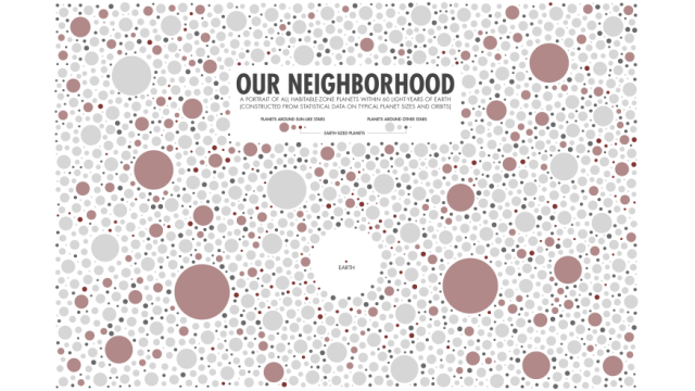
All The Habitable Planets Within 60 Light-Years Of Earth Visualised
There may well be more than 60 billion habitable planets littering the Milky Way, but it’s virtually impossible to make use of that figure. Instead, how about this picture, which shows you how many planets are within 60 light-years of Earth.