Humans have been writing for a long, long time — we were making lettermarks for thousands of years. Of course, that doesn’t mean we’ve ever reached a consensus about the perfect way to write or print. And over the past few years, we’ve seen designers take on real, tangible problems using type design.
The following three typefaces were designed with specific users and challenges in mind — rather than being formed based on purely aesthetic grounds, they were aimed at fixing problems like reading disabilities, driver distraction, and even the challenges of life as a programmer. Check them out below.
A Typeface That Helps Dyslexics Read
Dyslexie is a typeface created by a designer Christian Boer — who is himself is dyslexic and wanted to make a font to counteract the effects of dyslexia. So for example, letters that are similarly shaped were deformed in new and unusual ways to differentiate them from each other.
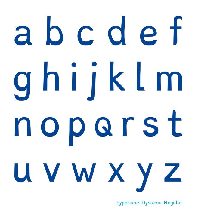
The sagging bottoms of the letterforms anchor them visually, as a counterpoint to the tendency of letters to flip and move for dyslexic readers. According to The Guardian, the font helps readers read almost 85 per cent faster.
A Font Optimised For Programmers
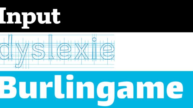
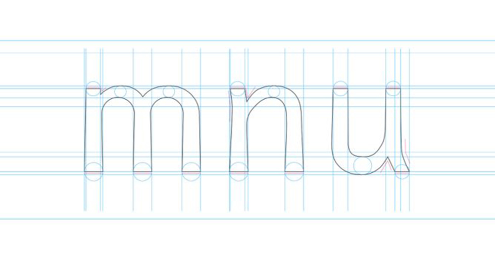
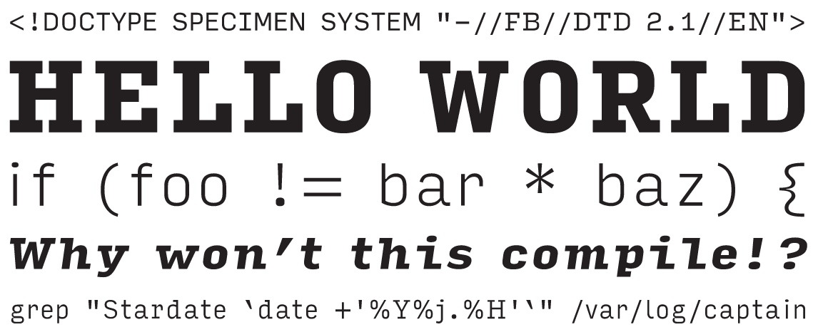
Most programmers use fonts like Fixedsys, which is monospaced (each letter is the same width) to make mistakes easier to spot. But these old-school designs tend to be taxing on the eyes and brain during all those hours spent staring at a terminal swathed in tiny text. That’s why David Jonathan Ross, himself a coder and today a font designer, created a typeface called Input.
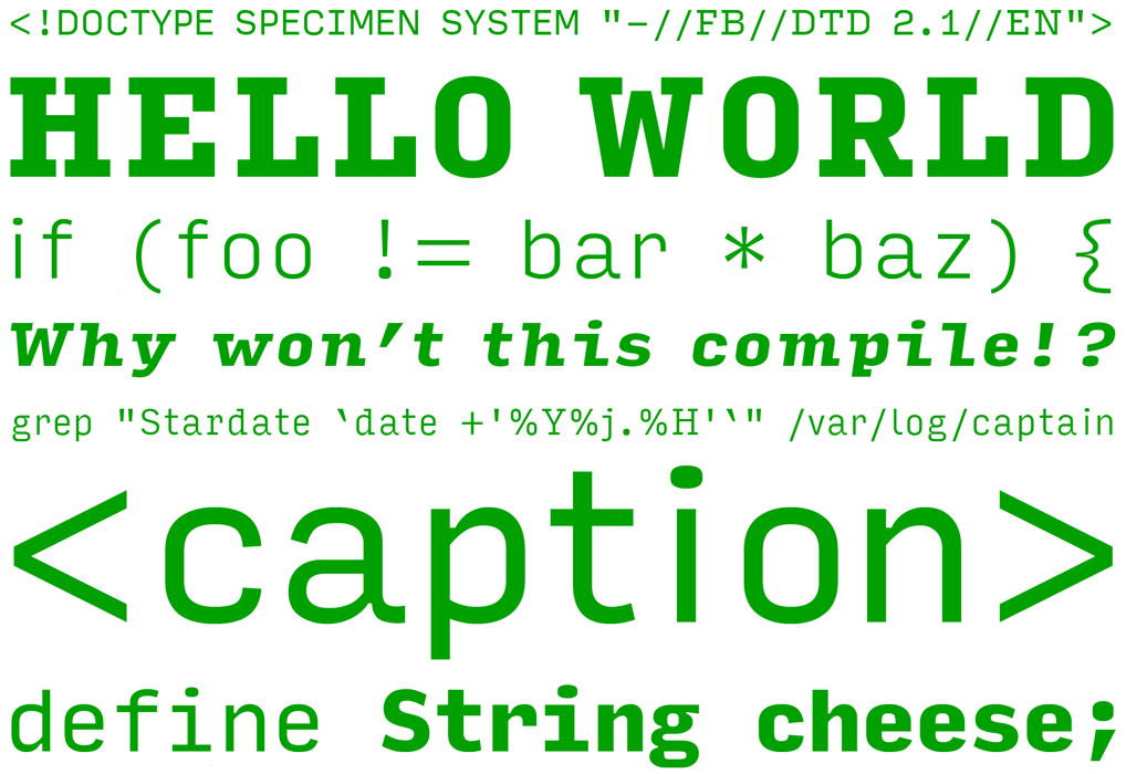
Like those fixed-width fonts of yore, Input is monospaced, but Ross gave it a variety of styles and sizes, all aimed at making those screens of text easier to skim and engage in over the longest workdays.
A Typeface That Distracts Drivers Less
Even if you don’t attempt the idiotic and text while behind the wheel, it’s becoming tough to navigate the road without looking at a GPS device or an auto interface every once and a while. The type foundry Monotype developed a font designed to make those inevitable moments of distraction less, well, distracting.
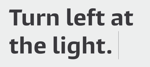
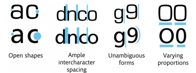
It’s called Burlingame, and it started out life as a video game font. What makes it great for drivers is the fact that none of its letters or numbers can be misread as any other — for example, there’s no ambiguity between o and 0, or g and 9. An MIT study found that drivers had a 13 per cent improvement in response time when reading Burlingame versus other typefaces.
