The old logo uses a complicated serif font which can only be created using bezier curves. All together, it has 100 anchor points, resulting in a 6KB (6380 bytes) file. When compressed, the size comes down to 2KB (2145 bytes).
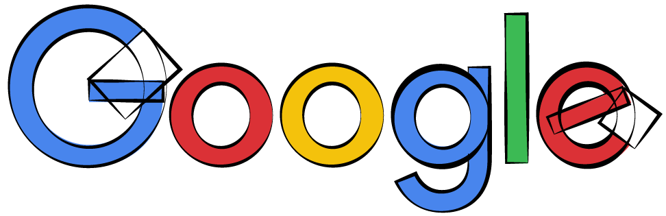
A simplified version of the new logo, on the other hand, can be constructed almost entirely from circles and rectangles (with the exception of the lower-case g):
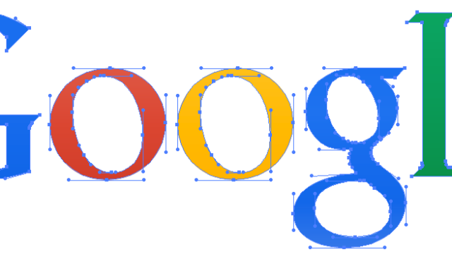
The entire logo consists of:
10 circles (2 each for the capital G and lower case g, 2 for each O, and 2 for the e)
5 rectangles (2 for the capital G, 1 for the lower case l, 2 for the e)
1 shape made with 7 anchor points (the descender on the lower-case g)
While Google hasn’t released the optimised 305 byte logo and it doesn’t seem to be available online, I believe that they got the size down to 305 bytes as they claim.
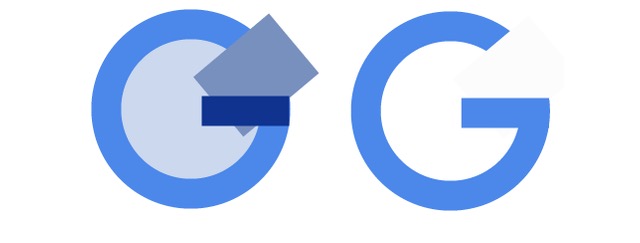
To verify this, I recreated the first letter (G) in the SVG format, resulting in a file that’s 302 bytes uncompressed, and 195 bytes compressed.
Here’s the entire uncompressed graphic, consisting of two circles and two rectangles:
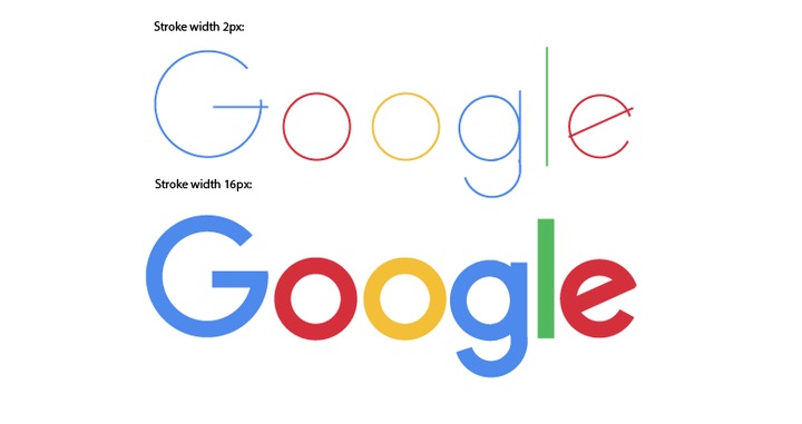
As another user pointed out, there is also a way to generate the new logo using strokes rather than fills. This is also something that wasn't possible to do with the old log, and can result in an even smaller file.
The code for the entire logo (courtesy of Jaume Sanchez Elias) is 290 bytes:
This answer has been lightly edited for grammar and clarity.
The Cheapest NBN 50 Plans
It’s the most popular NBN speed in Australia for a reason. Here are the cheapest plans available.
At Gizmodo, we independently select and write about stuff we love and think you'll like too. We have affiliate and advertising partnerships, which means we may collect a share of sales or other compensation from the links on this page. BTW – prices are accurate and items in stock at the time of posting.