Graphic design is a difficult art, and the global trend towards minimalism has made it more difficult to get right than ever before. While minimalist art can evoke cleanliness and refresh a brand’s identity, it can also lead to unfortunate comparisons, like the refreshed Amazon logo accidentally looking a bit like Hitler.
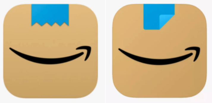
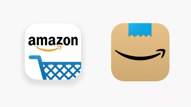
The new, minimalist logo for the Amazon Shopping app originally appeared in January 2021, and was designed to represent a taped-up box out for delivery. Unfortunately, people online quickly noticed the placement and shape of the tape strongly resembled a toothbrush moustache, most commonly associated with Nazi dictator and mass murderer, Adolf Hitler.
My parents use Amazon nearly every day. They’re going to be lost for the next few days. When they ask where Amazon’s gone, I’ll tell them to look for the cardboard Hitler… https://t.co/u1YcJUBNSN
— Sam Hutchings (@Smutchings) January 26, 2021
Amazons new App logo Does not remind me of Hitler… Amazons new App logo Does not remind me of Hitler…
Amazons new App logo Does not remind me of Hitler… pic.twitter.com/CAx0kWKeDm— Phil Whitford (@iamphilwhitford) January 26, 2021
The intentions behind the logo are fairly clear: it’s an Amazon box, complete with the iconic smiley-faced tick. But it’s also very easy to see the comparison to Hitler, and to understand why the image is extremely unfortunate. When you’re ordering from Amazon, you hardly want to click on a Nazi caricature.
[related_content first=”1673668″]
After weeks of online chatter and feedback, Amazon has now addressed the mistake and redesigned the app to better define the ‘tape’ part of the box.
Rather than a jagged, hair-like edge, the logo is now rounder and has a flipped-up adhesive corner. While it sticks to the design intentions behind the original logo, the tweaked version is much better and subtly removes any direct comparison to Hitler’s infamous facial hair.
Instead, the blue tape looks more like a silly little clown nose.

Users online have reacted favourably to the redesign, with some saying the app now reminded them of Aang from Avatar. A much better comparison, I’m sure we can all agree.
“Amazon is always exploring new ways to delight our customers,” an Amazon spokesperson told The Verge when questioned about the logo refresh. “We designed the new icon to spark anticipation, excitement, and joy when customers start their shopping journey on their phone, just as they do when they see our boxes on their door step.”
The update appears to have rolled out this week, but if you’ve still got the older version you can manually update it via your phone’s App Store.
