If iOS 14 was a visual overhaul that gave you full control over how your iPhone looks, iOS 15 is a logistical one that gives you full control over how your iPhone behaves, which in turn will change how you use it.
Let me back up: Many of us feel like our phones have way too much power over us, with their constant dings and buzzes and red badges that signify just how many alerts are beckoning our attention away from other, more important things happening in our actual lives. And Apple clearly recognises that people are unhappy with the amount of time they spend on their iPhones, which is why iOS 15 is packed with features that allow you to more carefully curate your experience with this glass-and-metal safety blanket/albatross. These features put you in the driver’s seat — they won’t work for you unless you put them to work — but once you take the wheel, so to speak, you’ll have a much more balanced relationship with your phone. Or at least that’s the goal.
I’ve been spending some time with the iOS 15 beta, which is now available for the public to install, and as a detail-oriented person who spends many hours of her day on her iPhone and would like to cut back, using new features like Focus and Notification Summary to customise every part of my phone experience definitely sparks joy. iOS 15 is not without its irritations (more on my Safari fury later), but it brings some welcome changes.
This preview isn’t meant to be a thorough evaluation of every single new feature — we’re still in beta, and some things will change before the official launch this fall. But this is a sneak peek of how it feels to use iOS 15 every day, and if you’re feeling brave and want to give it a try, now you can install it, too. The usual caveat applies: It’s best not to install beta software on a device you rely on, though I’ve found iOS 15 stable so far and have been using it with the iPhone 12 Pro I use daily.
Cool? Cool. Here’s what it’s like to live with iOS 15.
Ending Notification Overload
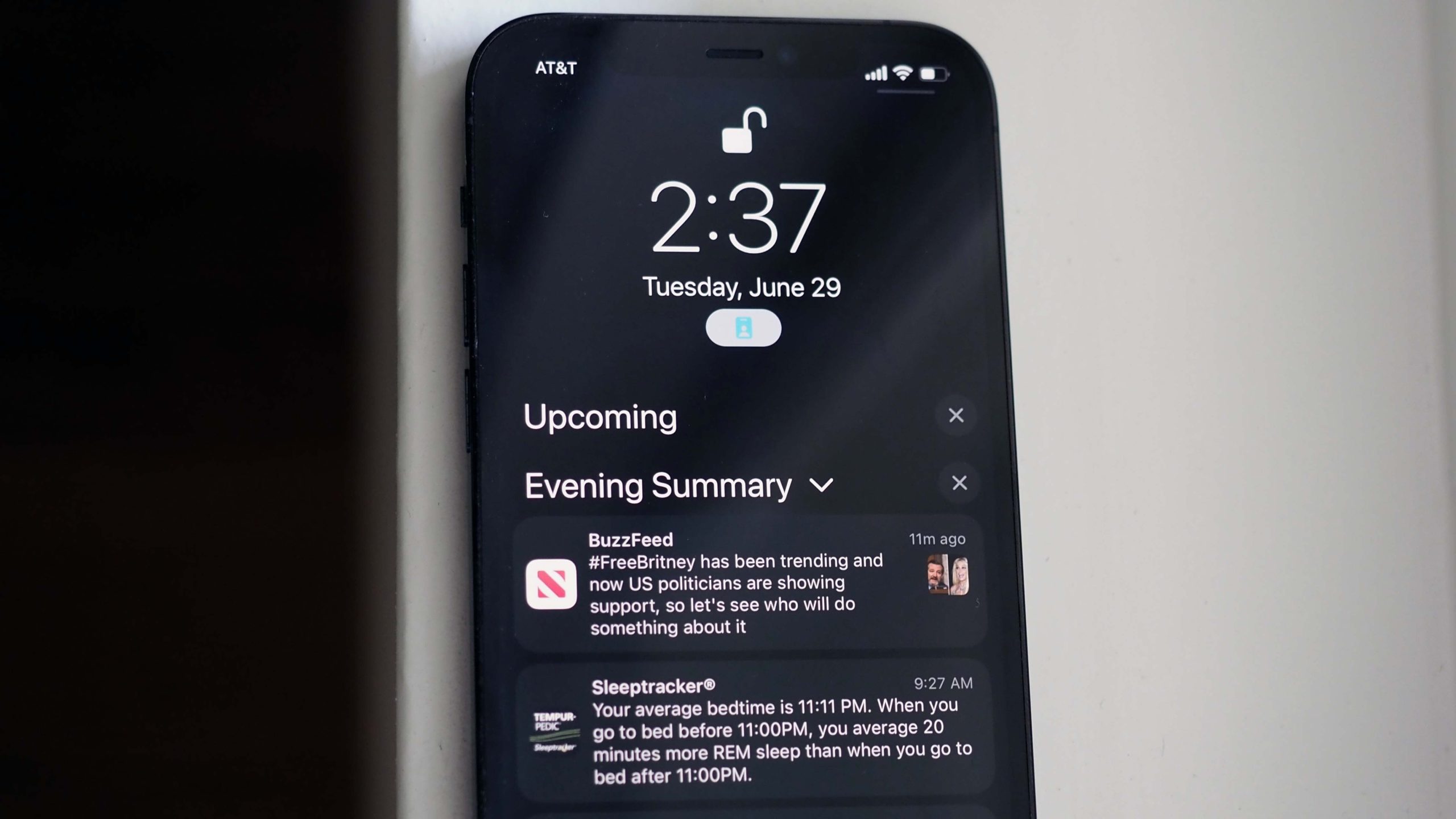
I hate notifications. But I love notifications. In my many years of iPhone use, I’ve whittled down the number of apps I allow to send me alerts. I try not to check Twitter after work, for instance, and it may take me ages to respond to a reply or a DM because I keep those notifications turned firmly off. But this also means I miss things that are timely. Apple’s new Notifications Summary feature gives me more granular control, so instead of feeling like I have to choose between all notifications or none at all, I can turn alerts back on for relevant apps and instead choose to have them bundled in one summary at a given time (or multiple times) throughout the day. It’s strange how such a little thing can make you feel a lot more in control of your brain.
Setting it up is simple: Tap Settings, then Notifications, and at the top, you’ll see a new option to create a Scheduled Summary. From here, you can choose what times of day you want to receive summaries. I receive summaries at 7:15 a.m. when I’m doing my usual pre-work phone scroll, 12 p.m. when I’m eating lunch, and 5:45 p.m., as I’m ending my workday and before I exercise. You can also customise which apps are bundled in the summary and which can break through and deliver alerts immediately. The new feature helpfully shows you which apps send you a shit-ton of notifications throughout the day to help you make an informed decision as to how often you really need to see those alerts. I want to see breaking news app notifications and Slack messages, but I don’t really need Postmates and Uber Eats to get through immediately (no matter how good those discount codes are).
I can’t say for certain whether the Notification Summary is cutting down my phone use — my weekly Screen Time reports are still disconcertingly hostile. But another iOS 15 feature goes further than the new summary does, and while I’m still figuring out how to make it work for me, Focus offers a dramatic shift in the way I use my phone.
Narrow Your Focus
The concept behind Apple’s Screen Time feature, which lets you see which apps suck up most of your time and exactly how many hours you have them open, is a good one. But god, it just makes me feel so guilty. You can give yourself time limits for specific apps or categories of apps, and while I honestly tried to abide by them for a while, I confess I began to ignore them and finally turned them off. Now I just get the depressingly consistent weekly reports. Yes, I realise four hours is a lot of time to spend on a phone. No, I’m not sure how to minimise that!
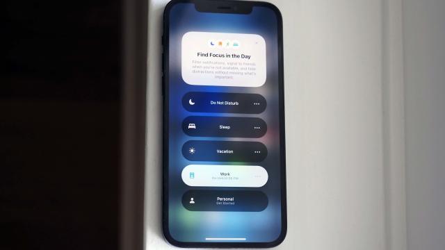
Well, Focus might be the answer. Like the Notification Summary, Focus gives you granular control over how you interact with your phone by focusing on alerts. Sure, I often mindlessly scroll Instagram of my own accord, but usually, it’s because I received a meme and the next thing I know I’ve spent another five minutes trying to find a suitable meme to respond with. The last thing I want to do is get caught up in an Instagram scroll-cycle when I’m trying to focus on work, so my new thing is a Focus profile specifically customised for boosting my productivity.
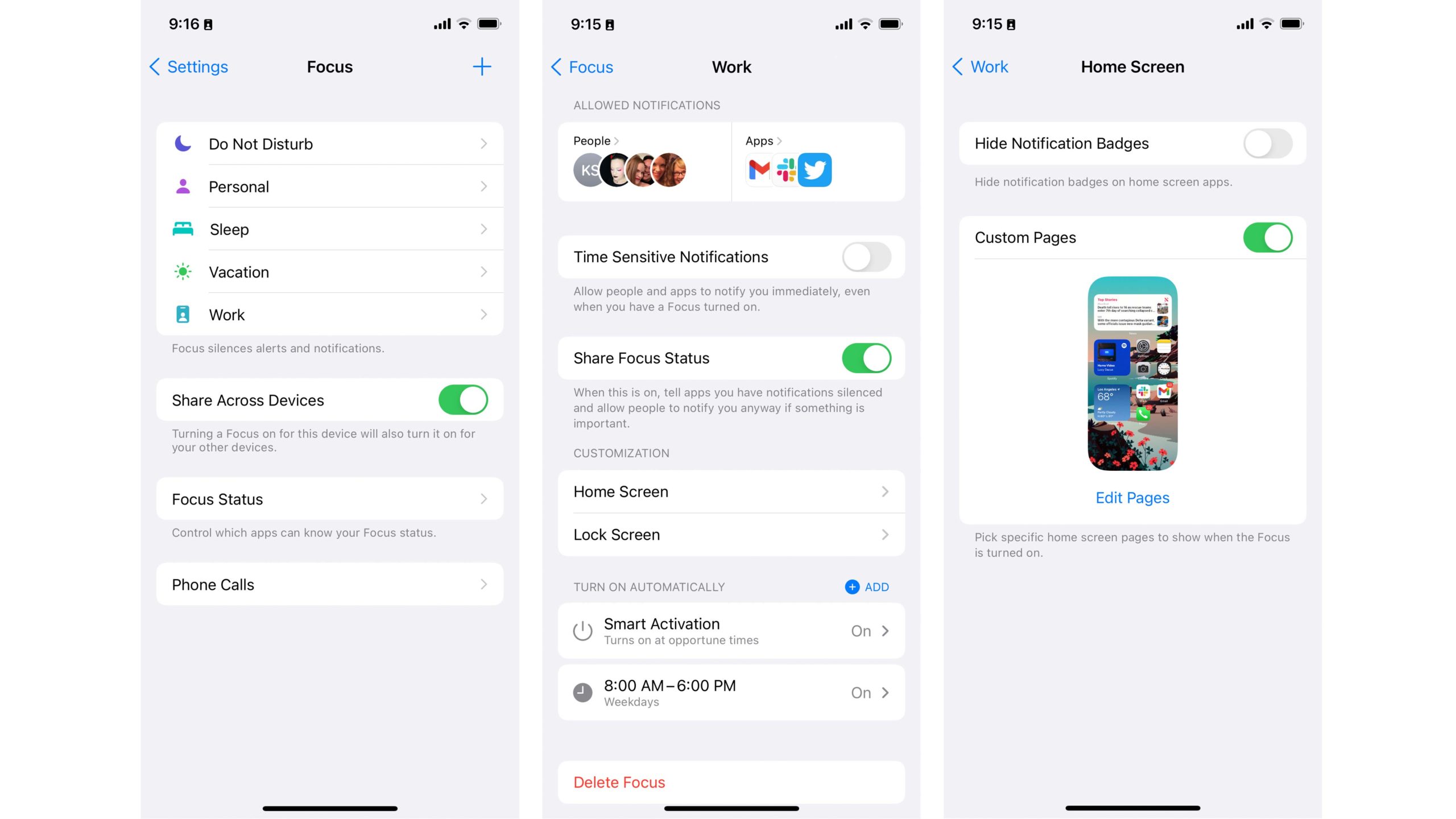
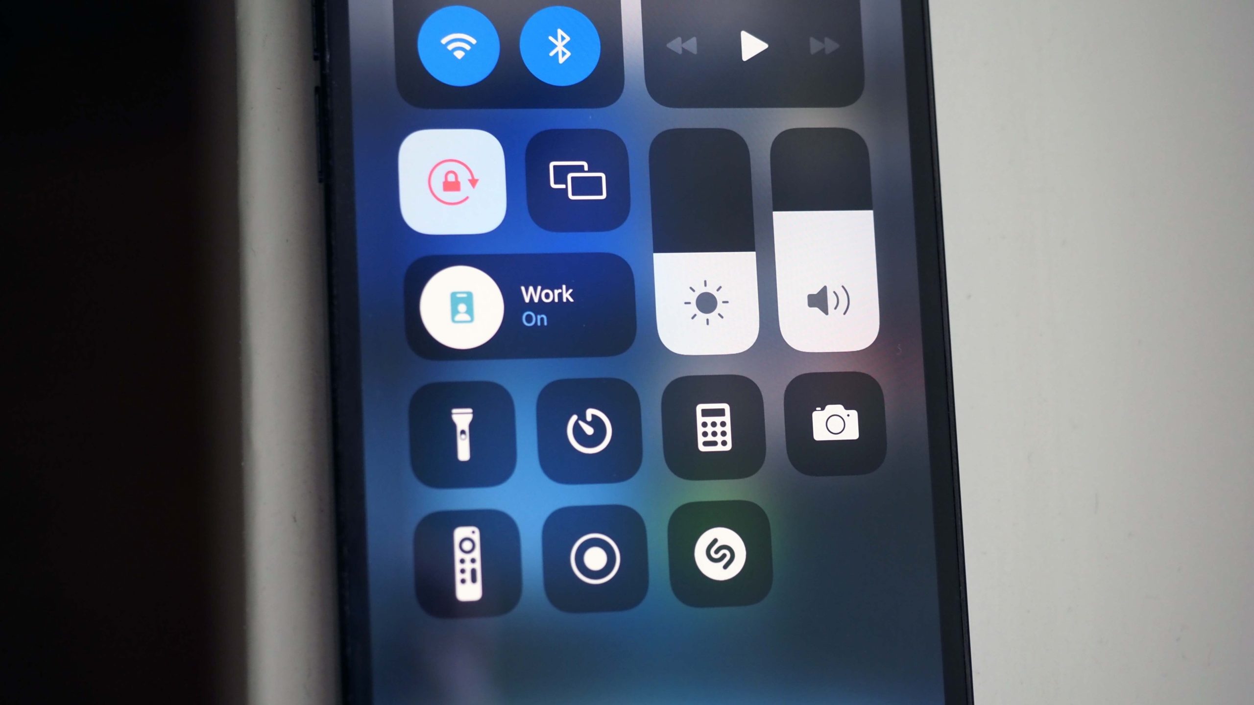
You can set up Focus in two ways: Either from Settings, or by swiping down from the top-right of your home screen to bring up the Control Centre. From there, you’ll see a new Focus setting. Tap it, and you can toggle on Do Not Disturb, switch to a specific Focus profile, or set up a new one. My “Work” setting is basically designed to allow notifications from apps I’m already using on my desktop (Slack, Gmail, Airtable, etc.). I also allow text messages through from a curated group of people. Everyone else gets a canned “I’m busy” response (though you can choose not to send this notification). Folks not allowed through can choose to send the message anyway, so it’s delivered “quietly.” I also set up a “Vacation” profile, because I know myself and I will absolutely check my work email and Slack while I’m on PTO if I receive any pings from those apps.
As part of Focus, you can set up custom home screens that banish all other apps. I spent an honestly ridiculous amount of time setting these up and painstakingly curating the apps that I wanted to see on my Work vs. Vacation home screens. My Work home screen has news headlines, of course, and small widgets devoted to Spotify and Weather (I am usually Team Giant Weather Widget, but I’m trying to be more practical). Quick access to apps I use constantly to get my job done, like Gmail, Slack, Voice Memos, and Notes, also earn placement on the Work home screen. My Vacation profile, meanwhile, is where Weather really shines. I banish email from that home screen and bring Instagram back.
I want to say all this has been useful, and maybe that’s true. Given that I’ve been using my Apple devices a lot to test out the new beta features, I can’t say for certain that my post-beta life will have less screen time — it’s the nature of this job. But I can say that this feature is far more useful than Screen Time, because it allows you to curate your distractions instead of punishing you with frankly rude notifications for feeding into them. Sometimes all you need to do is reframe the narrative, you know?
Fun With FaceTime
FaceTime is getting a long-overdue upgrade with features people actually want instead of… the ability to replace your face with a Memoji. (That’s cool and all, I guess, but come on.) The overhauled FaceTime is a welcome change, even if a year or so later than we all would’ve preferred.
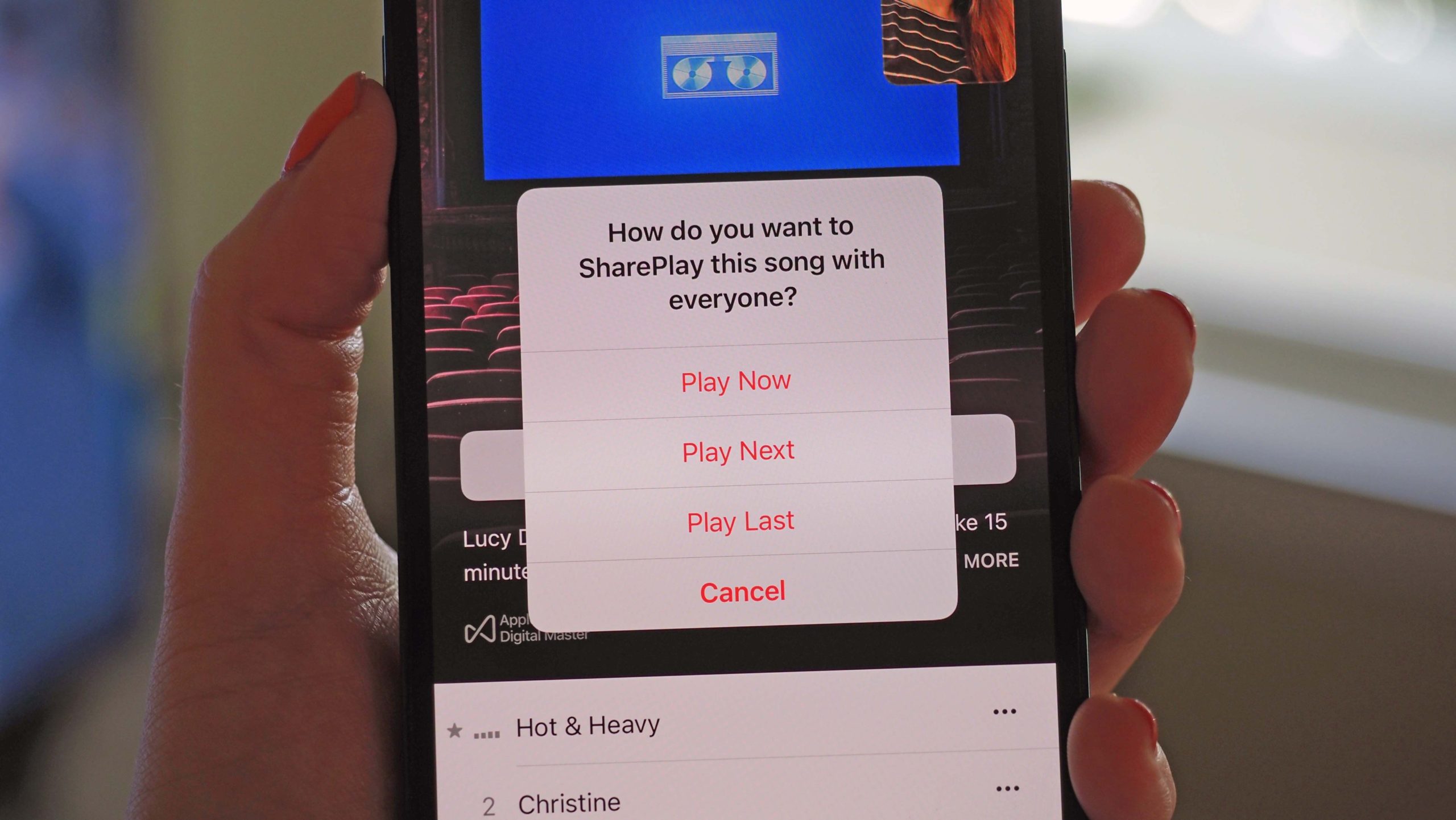
Let’s start with SharePlay, which is Apple’s version of a watch and/or listening party. While most of us were living under lockdown during the pandemic, I regularly watched shows simultaneously with friends, but it didn’t really feel like we were together. Sometimes we chatted on the phone while streaming something, or sometimes we listened to new albums and texted about them, but there was something missing. SharePlay lets you bring videos and music from supported apps into your FaceTime call, so you can watch or listen together while also seeing your loved ones’ faces and hearing their commentary.
How it works: After you hop on a FaceTime call, you can pop out of FaceTime and open an app that supports SharePlay (currently only Apple’s apps, with a slew of third-party options coming soon). At the top of the app screen, you’ll see a notification that you can immediately enable SharePlay. You can also start playing content without first activating SharePlay, and you’ll receive a prompt to play the content for just yourself or with your FaceTime contact(s). It’s incredibly easy to turn on, and there’s no lag whatsoever — when streaming a video in Apple TV+ with a friend across the country, we chatted while the video played, and I could both hear him clearly and see the video.
I really love this feature. I prefer it specifically on the iPad, at least when it comes to watching videos (more on that in my iPadOS 15 deep dive coming soon), but it’s also great on the iPhone, where you can quickly share your screen to browse a Safari page together or pop open Apple Music to dissect a new single from a fave artist.
As mentioned, the feature is currently only supported on Apple apps like TV+ and Apple Music, with more services coming when iOS 15 officially rolls out to the public. Disney+, HBO Max, Hulu, MasterClass, NBA, TikTok, Twitch, ESPN+, and Paramount+ are all on board. And with the SharePlay API, I expect that to expand. Your friend will also have to have a subscription to the service you want to use together, at least for Apple’s premium apps — there’s no getting around it. You also can’t screenshot or record content from within an app while using SharePlay. But the good news is that if someone takes a screenshot (which will be of your face and a blank screen), you’ll receive a notification instantly. You’ll also be notified when someone adjusts the playback, and you can adjust it, too.
I really prefer a bigger screen for watching videos, but once my nieces figure out that they can FaceTime and watch YouTube with their friends simultaneously, they might never leave their rooms. YouTube doesn’t currently support SharePlay, though you can technically use the screen-sharing feature to share whatever you want. It’s not as elegant a solution as in-app SharePlay support, but it gets the job done.
Android Joins the FaceTime Party
FaceTime has a slew of other new features, but aside from SharePlay, the second-biggest deal is being able to create a link to a FaceTime call. I can’t begin to count the number of times I’ve tried to coordinate a video call with friends or colleagues where we have to figure out which platform to use. FaceTime is a natural choice for those of us with iPhones — it’s far less cumbersome than Zoom, that’s for sure — but those on Android phones and PCs can’t jump in. That’s changed, and it’s really, really great. You can now create FaceTime links and share them out to anyone, no iPhone required. You can even schedule FaceTimes, though one weird hiccup is that you can’t schedule one directly from the FaceTime app. Instead, you have to hop on over to the Calendar app and create an invitation before being able to create a FaceTime link.
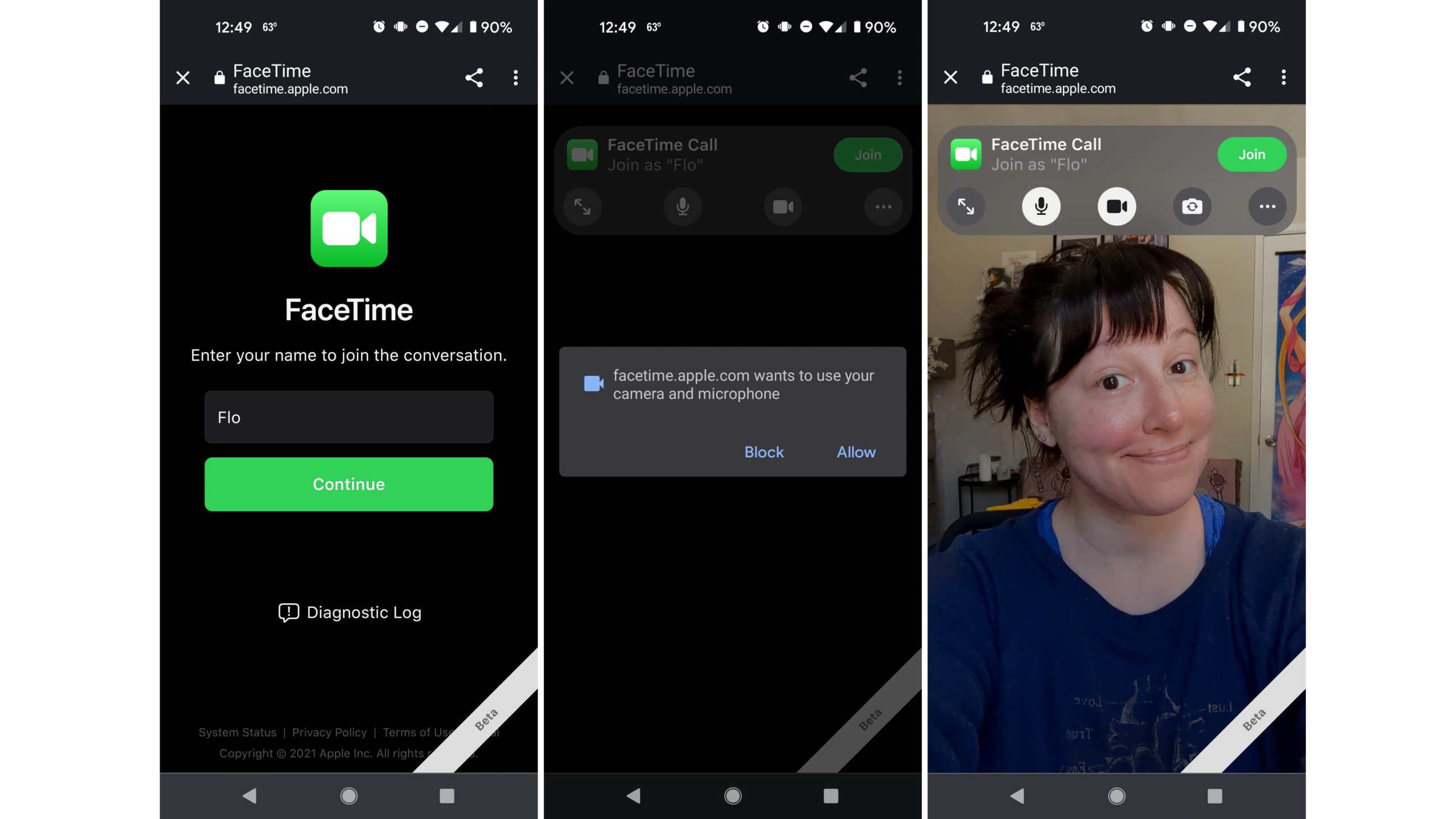
But otherwise, it’s totally seamless. I sent a calendar invite with a FaceTime link to my colleagues Victoria Song and Florence Ion, one of whom is using iOS 15 and the other an Android phone, and while the notification was a bit more seamless for Victoria on iPhone, Flo received an email with a link that she was able to hop into using her Pixel’s web browser — she just had to give FaceTime permission to use her phone’s mic and camera. As the creator of the FaceTime link, I received notifications when both Flo and Victoria requested to join the call; simply being invited and having the link didn’t allow them instant entry, which is a useful privacy feature.
Flo reported that using FaceTime on Android was a breeze. As a die-hard Android user who will never switch to iPhone but sometimes feels the Green Bubble Blues, she plans to use the new feature with her iPhone-toting family and friends — and I’m glad iOS is extending this olive branch to Android to avoid leaving anyone out.
New Safari Creates Problems to Be Solved
OK, so now that we’ve run through all the good in iOS 15, we need to talk about the… not-so-good. Safari, I’m lookin’ at you.
Safari’s redesign in iOS 15 is drastic. It’s the little things. It’s the big things. It all adds up to a really annoying experience that challenges my muscle memory on a near-constant basis. I have similar grievances with Safari in macOS Monterey and iPadOS 15, but using Safari on the iPhone is irritating in unique and specific ways — so far.
Let’s go over what’s changed: First, Apple has moved the address bar to the bottom of the screen. This makes it easier to tap on it when using your phone with one hand, sure, but after entering an address or a search query, the bar shoots back up to the top of the screen to make room for the keyboard. Press enter and it drops back down to the bottom. It’s weird, I hate it, and I’m still not used to it — and I have pint-sized hands that in theory should actually benefit from this placement.
Apple has also buried pretty much every option behind a menu next to the search bar. For instance, the reload button is gone — you have to tap on the More menu and then tap again to refresh a page. You can pull down on a webpage to refresh it, too, but first, you have to scroll up or tap at the top of the screen to jump back up, and this is an extra step that won’t be intuitive for most people. That menu is also where the Reader view option now lives — again, not a thing that most people will figure out quickly. It seems like a sure-fire way to confuse folks, with no real benefit.
Now let’s talk about Tab Groups, a new Safari feature I actually love. On my iPhone, I usually keep open pages to a minimum just because they’re too unwieldy. Now that I can keep them organised, well, I’ve been going wild. I have a group of tabs devoted to a place I want to travel to, another group of tabs for work-related articles I swear I will read later at some point, and another for clothes I plan to buy once the world fully reopens and I have to toss the jeans I haphazardly turned into cut-off shorts without really thinking that through. Tab Groups sync to your other devices to keep you organised. Some of you are tab freaks — I’ve seen an honestly unhinged amount of open tabs on a person’s iPhone before, so I know it to be true — and the good news is that there are theoretically an endless amount of Tab Groups you can create. (If you somehow hit the limit, congrats, and please email me to say how many.)
I’ve been using this new Safari for a while now, and I still can’t figure out what problems its design changes are solving. Safari was good before. Some of its new features, like Tab Groups, are actually useful. But the address bar, the reload button, the needless complexity — I really hope this is all fixed before iOS 15 officially rolls out.
Messages, Maps, Weather, and More
There are so many little things I love about iOS 15, and I’ve barely scratched the surface. Here’s a quick rundown of other features making my life much easier:
- Shared With You: A new Messages feature surfaces links and photos from your texts and puts them in easily discoverable places where you’ll actually remember them, like your Photos app for shared images or the Safari homepage for web links.
- Live Text: Apple’s new Camera feature that lifts texts from photos is, I believe, some form of wizardry. It’s so damn fast. If you’re using an iPhone XS or later, point your camera at anything with text on it — a magazine, a sign, a document — and you can capture, copy/paste, look up, or translate words directly from the camera preview. You can also select text from an existing photo, even ones you haven’t taken yourself. And if you’re in a blank text field, you can use a new keyboard camera option to capture text and paste it into the field. (This is super useful when it comes to entering things in Notes.) I absolutely love this feature.
- Weather: Apple brought the best features from Dark Sky over to the iOS Weather app, and I love it. I live in Los Angeles, so the more granular forecasts will probably be more useful for people in cities with actual seasonal variety, but I like the new design just the same.
- Maps: I’m a Google Maps kind of person, but the new Apple Maps looks damn good. It’s incredibly detailed, and the improved driving directions are definitely welcome.
There are some features that are still not available to try out yet, like adding driver’s licenses to the Wallet app, and others I’m still diving into. But overall, iOS 15 will be a meaningful upgrade — despite Safari — for those who want to regain some semblance of power over technology.
