Android Auto’s new look is rolling out to testers today, though it’s not ready for primetime just yet. The makeover teased earlier in the year is still only a beta. It won’t be available in full until 2023.
I got to check out the new Android Auto on Google’s test fleet at its headquarters. It’s definitely more refined than what I’m using now in my Subaru, and I’m eager to get on the beta myself and see how it translates behind the wheel. The design has a renewed emphasis on the split-screen interface, so that you can manage up to three tasks at a time without removing the focus from the main reason there’s a screen in your car: the map. And like Google announced in May, the interface is made to scale on various car screens, from big to small.
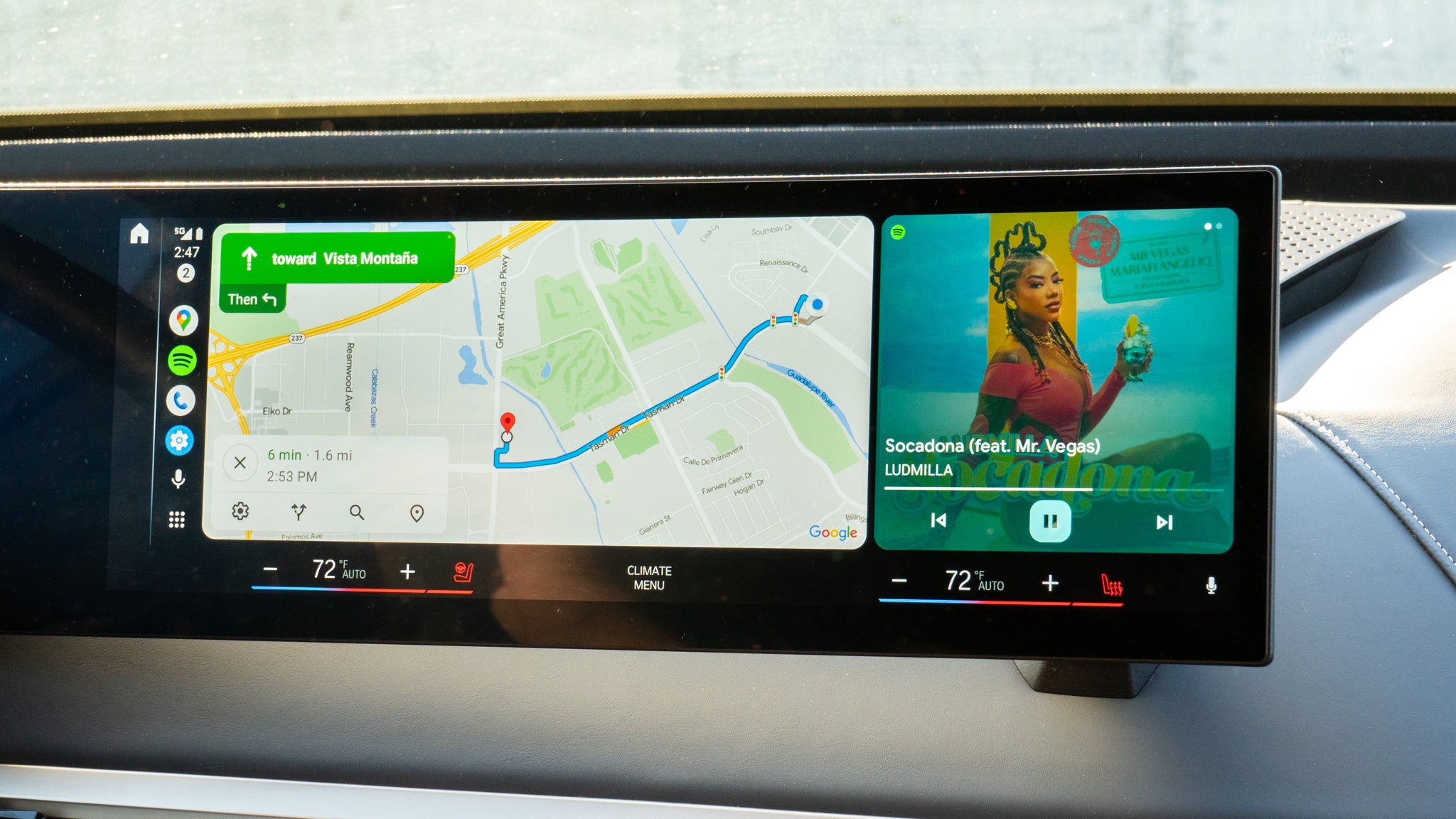
Split-screen for every display
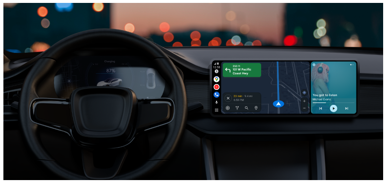
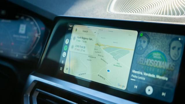
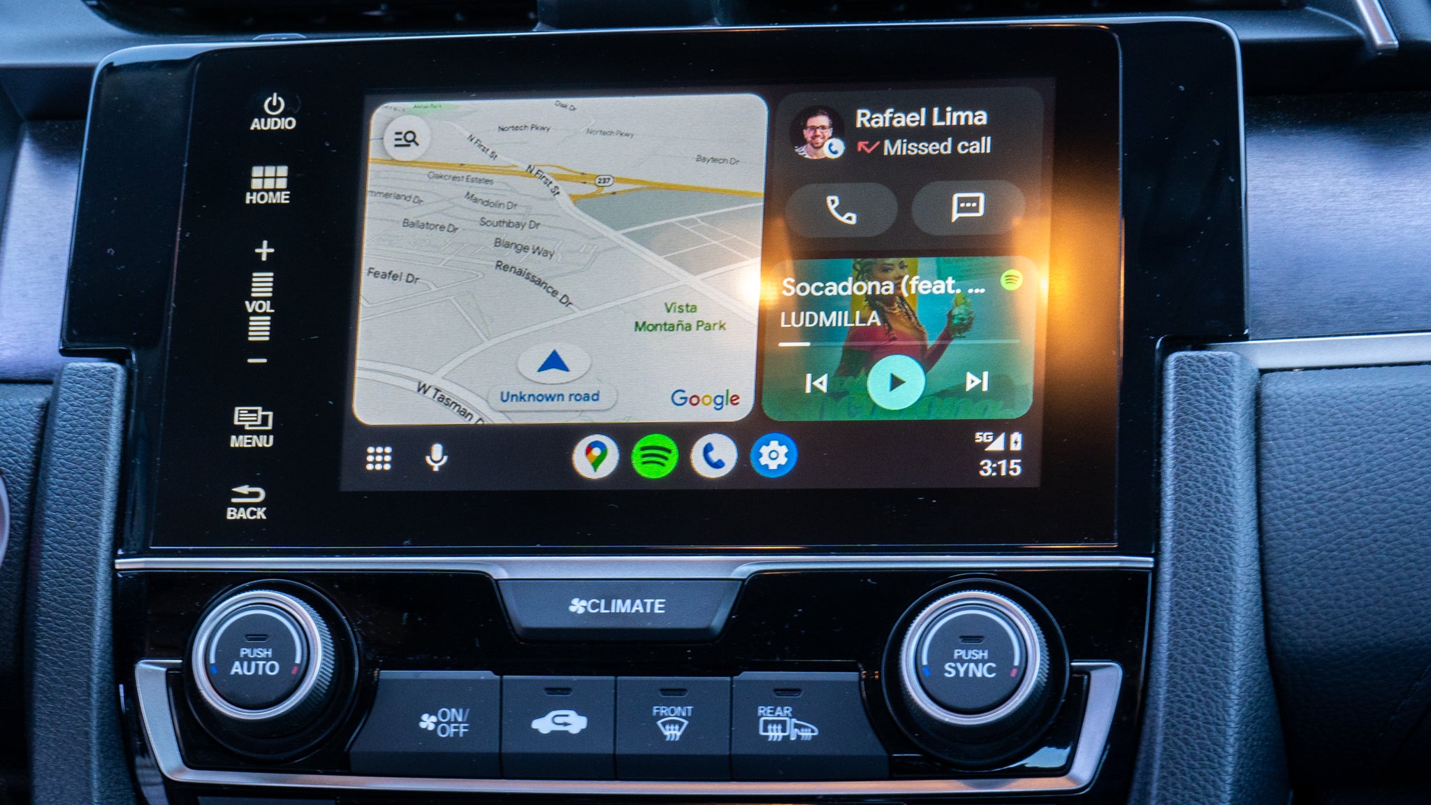
As Google promised, the new split-screen mode is coming to all car displays, and it makes better use of the available screen size. Rather than requiring you to tap around multiple times to switch playlists or make a phone call, the new interface splits based on the immediacy of the action at hand. For instance, if you’re looking for an album on Spotify, the screen will enlarge the “card” dedicated to the media playback while the rest of the screen stays devoted to Google Maps so that you don’t lose your place.
In some cases, you’ll get a third card on the screen. For instance, if a message pops in, you can select the notification to expand it to a corner of the interface. It’s less disruptive than the current way Android Auto handles notifications, which plays back the message through a persistent pop-in window, thus blocking out part of the map. If you don’t interact much with that third card, it will simply show the weather.
The split-screen card interface is much easier to glance at while driving and stays consistent. You can always expect your navigation app to be on the left, closest to the driver’s side — it’s on the right for cars in countries where the driver position is switched. One or two cards on the other side show either music playback or contextual information.
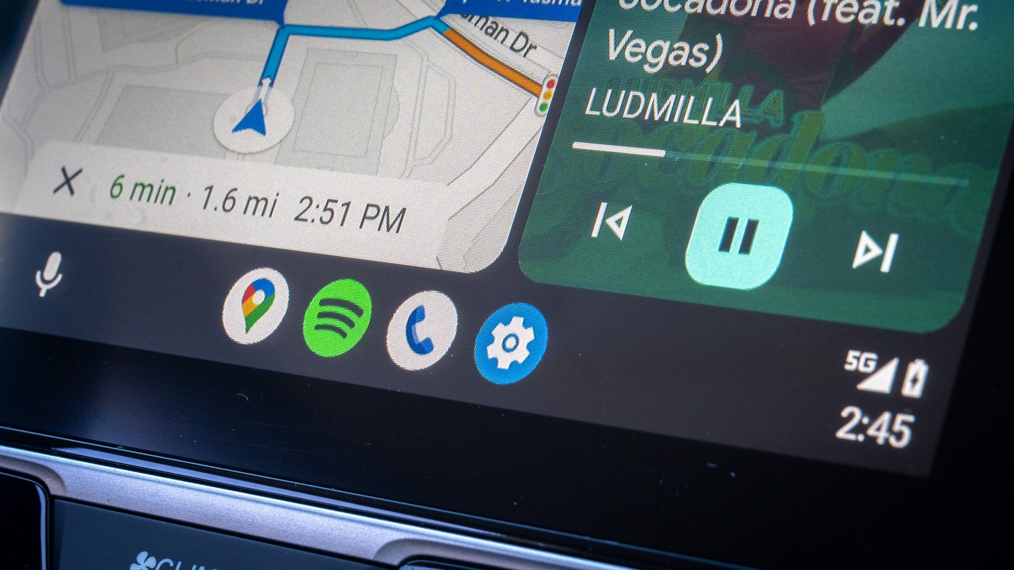
The dock area has also been consolidated. Now, only the three most essential Android Auto features are available as shortcuts. One icon will always reference the last navigation app used, the second will launch media playback, and the third offers access to the various communication apps installed on your phone — whichever Android Auto deems you use the most.
It feels more like Android in the car
The new Android Auto feels more Android-y than the current version, as there’s more Material You flavoring throughout. In particular, the media playback card looks like it was plucked straight out of the notification shade that’s on Android 13, offering a more fluid experience between Android on the smartphone and the display in the car. However, I’m not sure I’d feel the same if I were using a third-party Android device. Android Auto feels like Google, while Samsung and OnePlus’s devices do not, because they run their versions of the OS.
Still not ready for primetime
The final release of Android Auto will look like these photos, barring a few minor feature additions. For example, the highly-requested ability to scrub through a song by dragging your finger across the timeline isn’t currently in the beta, though it is planned for the launch.
I welcome these changes to Android Auto; frankly, they can’t come soon enough. In its current implementation, Android Auto feels clunky, especially if the car you’re driving isn’t accommodating to third-party software. But I’m optimistic these new changes will benefit even the most annoying dashboard setups. At the very least, the reimagined card interface is easier to glance at and ensures that it’s always the maps taking precedence over everything else — the way it should be with screens in the car.