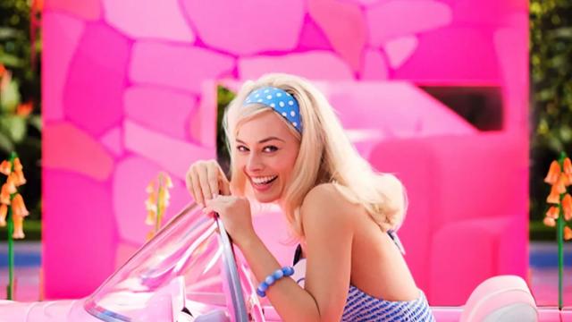
Throughout all the trailers and promos released for Barbie, it’s clear that director Greta Gerwig is going for a splashier, brighter colour palette than most live-action blockbusters these days. Pink is the most pervasive colour in the footage shown thus far, and as it turns out, the film basically had a monopoly on the colour during production.
According to a recent interview with Architectural Digest, production designer Sarah Greenwood and Gerwig talked about the overwhelming pinkness of Barbie Land. Gerwig said she wanted the pinks to be “very bright, and everything to be almost too much. Maintaining the ‘kid-ness’ was paramount.” To do this, the crew used fluorescent Roscoe paint, and Greenwood noted that so much of this specific shade was used that you couldn’t get it anywhere else in the world. “The world ran out of pink,” Greenwood laughed.
As the name implies, Barbie Land is where all the different versions of Barbie (and also Ken) reside. For Gerwig, she aimed for “authentic artificiality and aimed to “capture what was so ridiculously fun about the Dreamhouses.” Greenwood and set decorator ordered a Barbie Dreamhouse to study in order to figure out how to “make Barbie real through this unreal world,” and their primary influence was the midcentury modernism of Palm Springs. Additionally, the house was designed without any walls or doors, with Gerwig noting that it calls back to the design of Barbie’s Dreamhouse sets. “Dreamhouses assume that you never have anything you wish was private — there is no place to hide.”
Barbie releases in theatres on July 21. You can read Architectural Digest’s full interview here, which contains further insight on Dreamhouse design and additional influences on the movie’s production.
[via IGN]
