
Animations created by NASA’s Scientific Visualisation Studio include images and videos showing what carbon emissions would look like if they were visible in our atmosphere. The videos of the swirling emissions were released this month — and it looks like a grosser, creepier version of the Northern Lights.
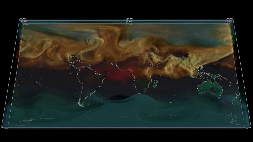
The visuals are recreated from 2021 carbon dioxide emissions data, according to NASA. They’re shown as swirls all over the planet and how those emissions progressed from the beginning of 2021 to the end of that calendar year.
Fossil fuel-related emissions are in orange, burning biomass shows up as red, CO2 created by land ecosystems are in green, and emissions from the ocean are in blue. Disturbingly, but also not surprisingly, the Northern Hemisphere is covered in swirls representing fossil fuel carbon dioxide emissions.
The green pulses in the visuals show how lower emitting parts of the world suck in as much carbon as they can. The ocean pulses blue as it sinks some of the carbon as well.
Discussion about pollution and emissions are hard to understand when we can’t always see them — unless we’re talking about recent wildfire smoke that is. But many forms of greenhouse gas emissions feel theoretical. We can see the causes of emissions, like oil and gas infrastructure. We can see the disasters that follow, including oil spills or contaminated waterways, but not the emissions themselves.
We know that global emissions are high and that we need to make a u-turn on pollution to stop the world from reaching dangerous climate thresholds. The world has already reached some of those tipping points — we’re experiencing rapid sea level rise, and alarming rates of melting ice at the poles. Earth is also set to reach 1.5 degrees Celsius of warming before the end of this century. There is still some time to make a u-turn and lower emissions from fossil fuels, but that window of time quickly closing up.