As MySpace, Kozmo and the Chicago Tribune all learned to their chagrin, being first isn’t always best — but someone’s gotta do it. This week, at one of the most comprehensive typography exhibitions ever staged, we got to see some of the early technologies that predated digital type.
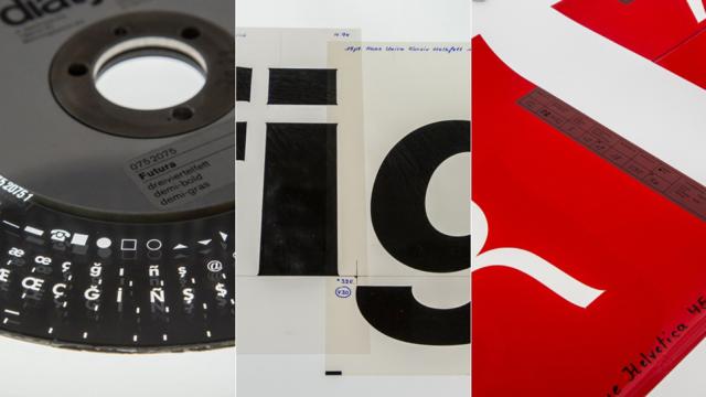
The road from one technology to another is always filled with iterations — small steps that move us closer to the end goal. Typography is no different. Designers made the transition from hot metal machines (the big, noisy sort you see in old movies) to computers over the course of two decades, and the way was paved with dozens of different long-forgotten machines and techniques. Ever heard of Diatype? What about phototypesetting? Me neither.
Lucky for us, a new exhibit called Pencil to Pixel, staged by one of the oldest type companies around, preserves some of the most fascinating relics from the 1970s and 1980s. The show’s curators explain:
We have moved from hot metal letterforms, to photosetting into a digital realm of endless possibilities where hundreds of thousands of font choices are easily accessible and a diverse range of screens. This breadth of choice, coupled with the endless possibilities of ways and formats in which to appropriate these typefaces has transformed how we interact with everything from our friends and family, governments to advertising.
Below, take a peek at how type was set just before the era of the pixel.