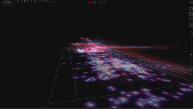
Here’s something cool. A studio called JWT Spain made a 3D app that tracks the trajectories of every ball hit in a tennis match in real time, and then spits out fancy visualisations.
There’s a heatmap that shows where the most balls land; trajectories of the ball for every set, game and point; a particle view that shows where the balls have the most impact; and options to control the opacity of the court, the colour of the ball trajectories for each player, and how fast the court rotates. It can be filtered by set, game or point.
Right now this has only been applied to three past ATP matches, but it would be great if it got a wider application. It’s a very fun tool to poke at for now, but something like this for every match played — something similar to Kirk Goldsberry’s shot charts for the NBA — would actually be useful for analysing how matches played out, and broader trends for individual players.