Today, Android published a helpful blog post offering up a list of design tips for developers slaving away over new app icons, encouraging them to use shadows, textures and micro detail. We’re watching Android grow up into its own distinct visual identity — independent even from Google mothership.
The list comes courtesy of Roman Nurik, of Android’s Developer Relations, who explains that “as higher density screens on both phones and tablets gain popularity, it’s important to make sure your launcher icon is crisp and high quality.” Nurik’s tips include:
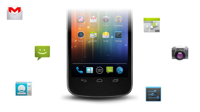
- Icons should be three-dimensional, with a slight perspective as if viewed from above, so that users perceive some depth.
- Designers should avoid simple square/circle icons and instead opt for unique shapes.
- Launcher icons should be simple at the macro level but still detailed at the micro level (e.g. include subtle edge effects, gradients and textures).
- Avoid mimicking visual elements and styles from other platforms (hint, hint!).
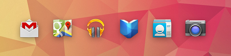
In contrast to the iOS guidelines we saw Apple present at WWDC, it seems that Android is actually encouraging designers to tack on extra drop shadows and glossy reflections, which is the exact opposite of Google’s new design directive.
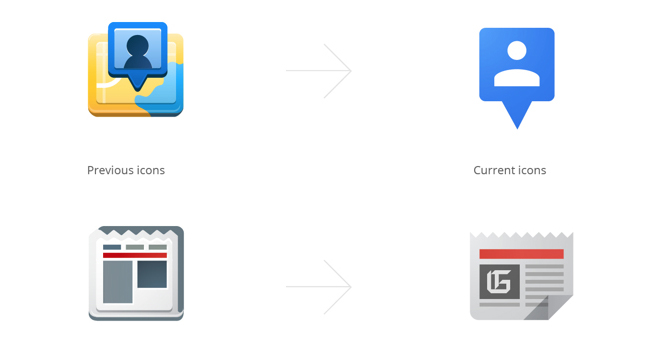
Last month, Google Art Director Christopher Bettig published company-wide visual guidelines that details how design should be approached, right down to shading and perspective. Interestingly, they differ quite a bit from today’s Android directives. For example, Google’s stance is that UI icons should be reductive pictograms, free of unnecessary shadow and detail:
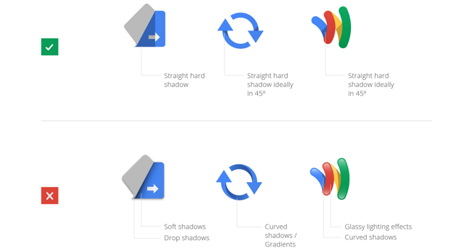
It definitely conflicts with Android’s tips, which encourage edge effects, gradients and textures:
It’s not a bad thing. In fact, it’s really interesting to see Google and Android going separate ways as far as design is concerned. Google started off with a pretty lousy reputation for graphic design, if not user experience design. The most famous anecdote, of course, is that the company did dozens of testing rounds to determine which of 41 shades of blue was most conducive to its UI.
But over the past two years Google has spent a considerable amount of time and resources trying to nail down a consistent design direction across their diverse product ecosystem. This inconsistency between Android and Google doesn’t mean they’re failing — just that there are competing ideas about what makes a solid piece of design.