Apple Music on iOS? Pretty good! Apple Music on your desktop? Pretty widely criticised as a steaming pile of garbage — largely because of the messy iTunes integration.
More and more users have pointed out the growing problems with iTunes of late; just this week, The Atlantic’s Robinson Meyer gave us a long, very specific rundown of all of the user experience screw-ups that prove iTunes Really Is That Bad. Meanwhile, “the iTunes Store back-end is a toxic hellstew of unreliability,” writes Marco.org’s Marco Arment. “Everything that touches the iTunes Store has a spotty record for me and almost every Mac owner I know.” Some have even wondered if splitting Apple Music off of iTunes would help, as Ben Lovejoy recently suggested.
Well, that’s exactly what designer and developer Andrew Ambrosino decided to mock up for the hell of it — and the results aren’t bad. “For Apple Music to win, iTunes as we know it must die,” Ambrosino explains on his website. “Anyone who uses Mac regularly with Apple Music is clamoring for a standalone Apple Music app, just like on iOS, and just like Photos on OS X.”
His first move? Simplify the player UI element. “One navigation bar up top, one player down bottom. Content in between. And a grid that makes more sense (really — go compare them!),” he writes.
On his redesign of the much-criticised My Music feature:
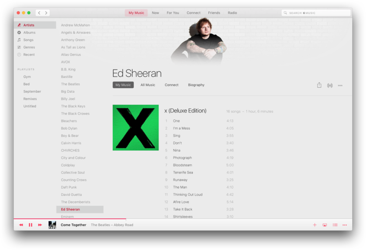
‘My Music’ was interesting to design. Apple has had a war on the sidebar for several versions of iTunes and even groups playlists in a separate section. This creates two major issues. First, the discoverability and simplicity of switching from song view, artist view, or a playlist is poor. Second, most users don’t know you can drag a song into a playlist, since the playlist pane only appears when dragging begins. In trying to visually simplify the UI, Apple just made it more complicated. Here, I’ve made a few changes. One is a double-level “sidebar” on the left that provides discoverability, speed, and simplicity both in interaction and in visuals. Second point — from this screen, I’m not limited to just my own music.
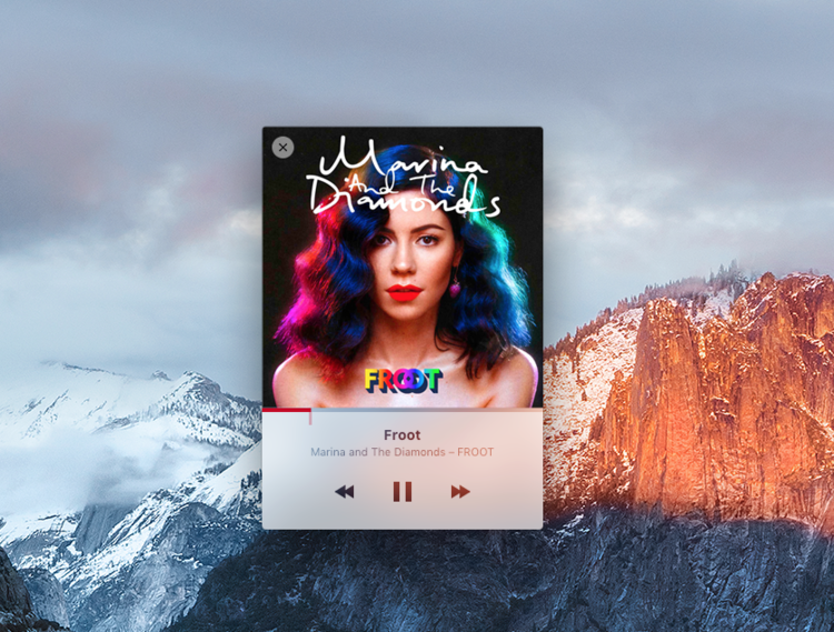
There’s a clean, simple mini-player, too.
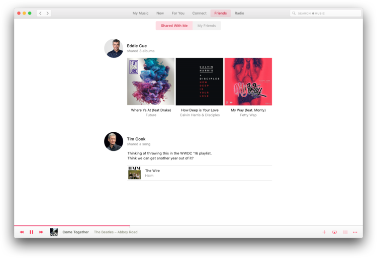
“I’ve been wondering why sharing isn’t part of Apple Music. In this concept, my friends can share with me, and I can also check out my friends’ public playlists,” he says of this screen designed for sharing within the app, though right now, it is possible to share via email, Messages, and Facebook and Twitter.
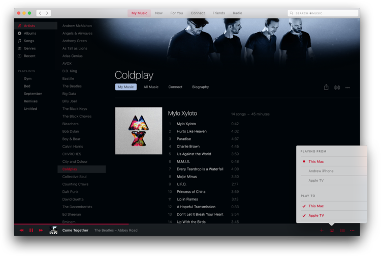
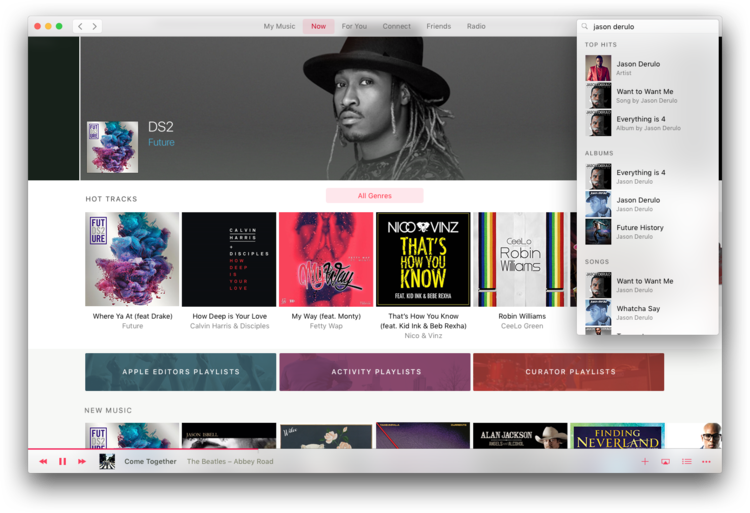
He also makes use of a dark theme for digging into specific artists’ discographies. Be sure to hover over the upper-left hand corner of these images and hit the zoom button to get a better look.
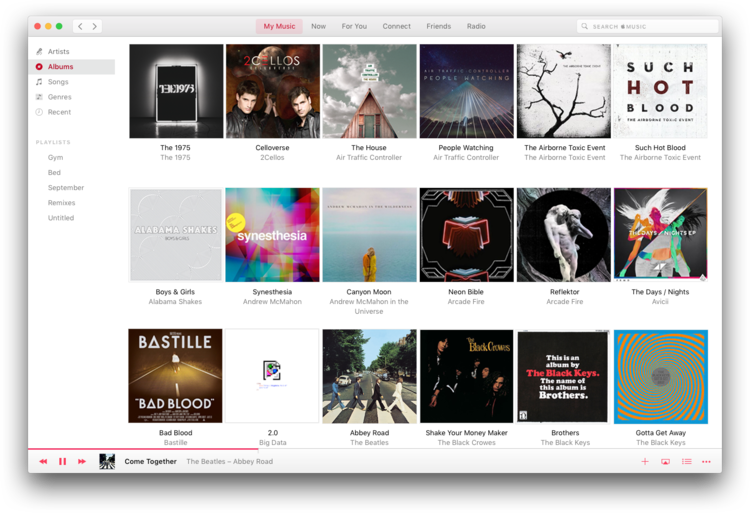
Album view has a clearer focus, too: “When I want album view, it’s one click. The sidebar stays and the content gets replaced. One click, highly discoverable, and still visually elegant.”
Of course, as we’ve discussed before, an independent designer redesigning a popular app or service means that the finished product isn’t beholden to the pressures of a real-life product — it’s an unrealistic exercise, but a very fun one. Ambrosino’s explanations are concise, his mock-ups are clean, and his case for splitting up this terrible duo are very compelling. Check out the full mockup here. [Andrew Ambrosino; h/t Techblock]