If you’re interested in data design, you’ll probably be very jealous of the developers and scientists at the National Oceanic and Atmospheric Administration’s Visualisation Lab.
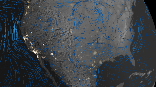
The Lab is charged with taking the government’s vast trove of data about the Earth and building public-facing tools that communicate that information visually. The latest, which the NOAA announced on Twitter Thursday, is called WeatherView. It’s a web app that gives you a close-to-real-time animation of weather patterns around the globe, pairing wind patterns with metrics like pressure, temperature, precipitation.
It’s a bit like a more holistic version of this NOAAView tool, announced last year.
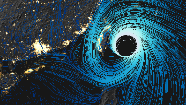
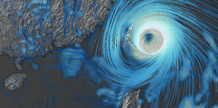
With WeatherView, it’s possible to track major weather events as they move around the globe. The NOAA gives us the example of Typhoon Soudelor, which passed over Taiwan yesterday. Using the visualisation app’s switches, you could customise the interface specific to meteorological metrics beginning with wind (overlaid with the app’s day/night option):
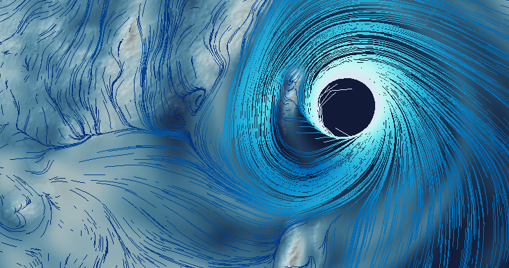
Or watch with wind data paired with moisture:
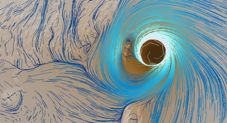
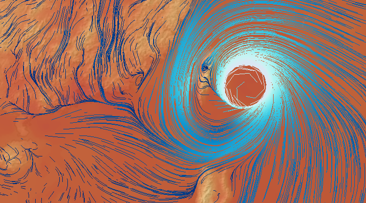
Pressure is another interesting filter:
Or precipitation:
Or, finally, temperature:
Of course, there are plenty of other weather events to explore, as well. One of the most surprising things about the map is how high-resolution it is. You can pinch-to-zoom down to a fairly local scale to see the conditions near you — and see how the macro-scale patterns move through your region and out into the world.
The information comes from the NOAA’s National Centres for Environmental Prediction, the organisation in charge of distributing weather data to other agencies, weather services, and meteorologists. So it’s not as though this data is somehow novel — it’s that the visualisation lab has taken what’s available and built something novel with it.
[WeatherView; h/t Citylab]