data visualization
-

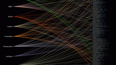
The 500 Most Popular Types Of Porn In One Chart

Everybody watches porn but everybody has different tastes. And there is just so much porn to watch. But how can we figure which type of porn is most popular? This chart from Data Looks Dope’s Max Einstein reveals the top 500 video tags in porn. You’ll see everything from hardcore to Argentina.

-
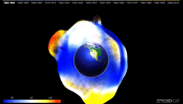
Global Warming Visualised In One Scary Animated 3D Graphic

Nicolas Belmonte — Technical Lead for Data Visualisation at Twitter — has created an impressive interactive 3D visualisation of the world’s temperature anomalies since 1800 using data from NASA. It’s like a deformed monster bloating and about to explode.

-
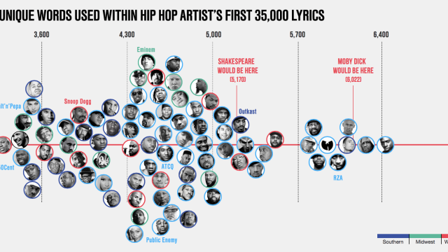
Largest Vocabulary In Hip Hop Uses More Unique Words Than Shakespeare
Designer and data scientist Matt Daniels charted this awesome comparison of vocabularies in hip hop. At the bottom of the chart you can see DMX with only 3214 unique words. Outkast has more unique words in their lyrics than Shakespeare, but everyone is way behind Aesop Rock, who rules with 7,392 words.
-
How Long You Have To Work Minimum Wage For One Beer, By Country
No matter where in the world you live, you’re working for the weekend. How much you can enjoy said weekend, though, varies greatly from country to country. Meet Quartz’s Beer Index. It’ll make you glad you’re not in Georgia.