logos
-
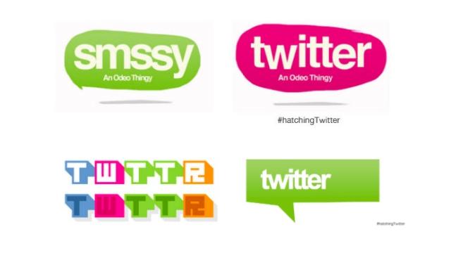
Twitter Was Almost Called Smssy (And Almost Looked Awful Too)

If you’ve ever thought Twitter was a silly name, be grateful that’s what they settled on. During the research for a new book about the site, Nick Bilton has unearthed some of the early name and logo ideas, and they… they aren’t pretty.
-
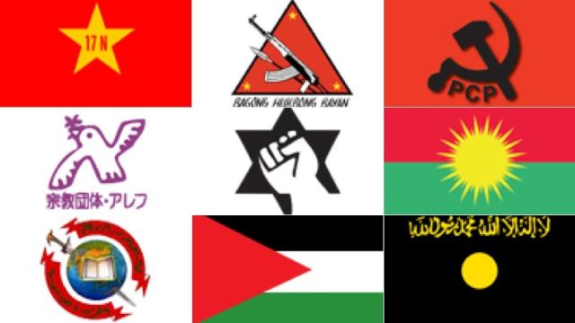
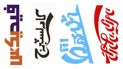
The US Army Guide That Teaches Soldiers To Recognise Terrorist Logos
Modern warfare is defined by ambiguity — and with it, soldiers (and training) have had to adapt. Posted online this week, a US Army document guides soldiers through the rigors of recognising terrorist and insurgent groups in the wild. Not through weaponry or language, but through branding.
-
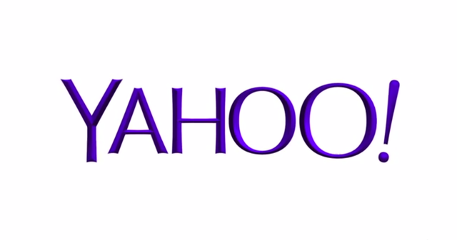
Yahoo’s New Logo Is Boring, And That’s The Whole Point
Yahoo finally unveiled its new logo after 30 days of zany decoy versions. It’s a staid little number, the main surprises of which are its intense new shade of purple, an ever-so-slight serif, and an odd architectural shadow effect. It’s a more traditional, adult design — and it hints at how Yahoo is changing on…
-
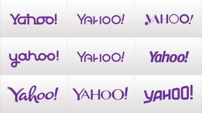
Yahoo Announced A New Logo By Not Announcing A New Yahoo Logo

In what could possibly be the most convoluted way to put on a new pair of purple pants, Yahoo has announced that it will be changing its infamous purple exclamation point logo into… something different. You see, it’s not the new simple logo above even though Yahoo posted an image of that new logo in…