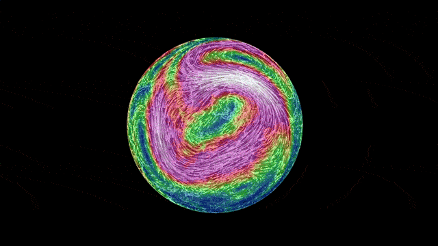
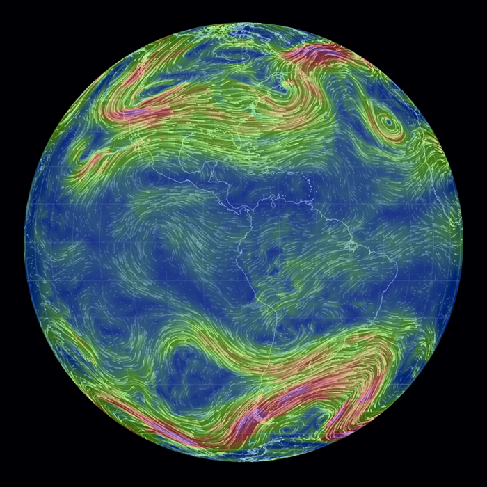
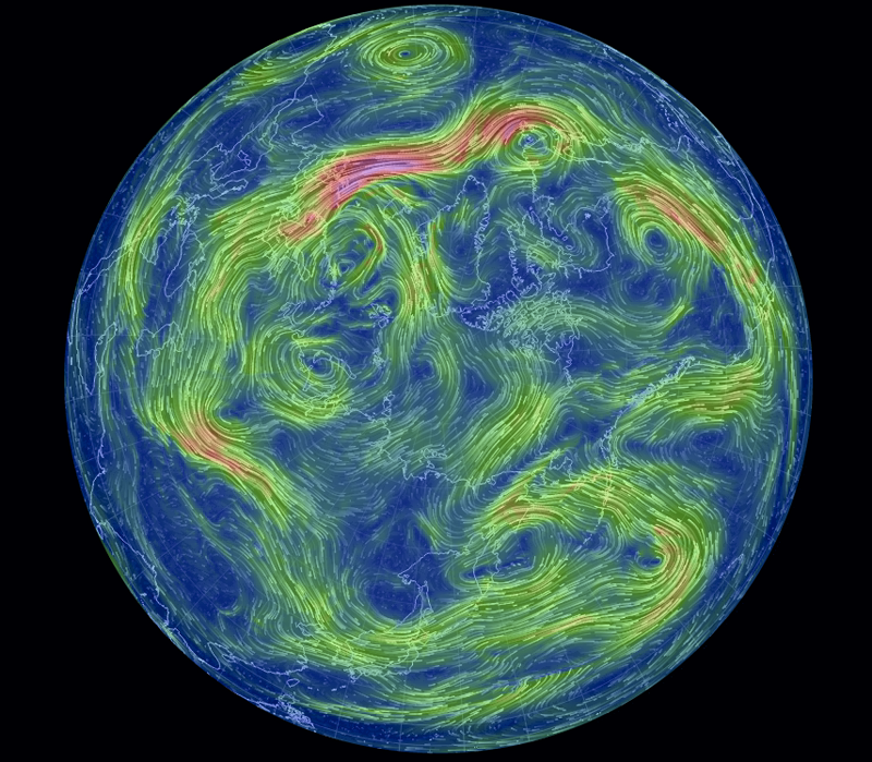
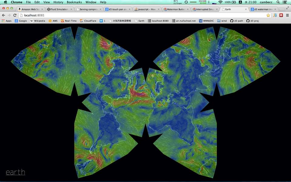
Earth from above is a beautiful sight and, apart from cats and porn, there’s almost nothing the internet likes more at the moment than data visualisations. Combine the two and you’ve got solid gold — or in Earth’s case, a stunning, technicolour look at global wind and weather conditions.
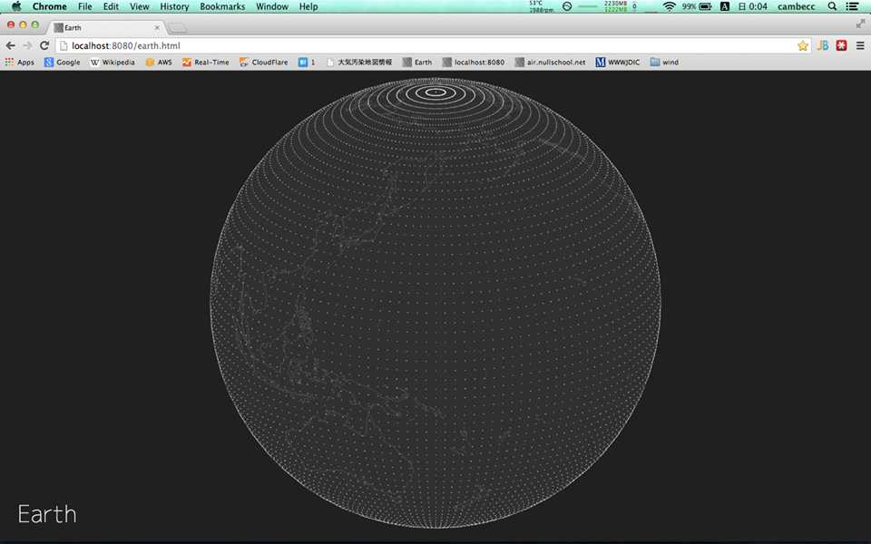
The animated map was made by Tokyo-based software engineer Cameron Beccario. Using info from the National Weather Service’s Environmental Modelling Center and Natural Earth, he developed the project in GitHub as a means to teach himself JavaScript and browser programming.
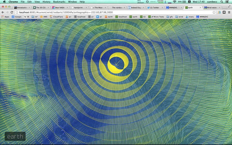
The result is a mesmerising, continuously moving look at the flow of air around our planet. Clicking and double-clicking around will give you specific coordinates and zoom capabilities — but, honestly, even if you have no idea what the hell is going on it’s still beautiful to watch.
There are some cool shots of the creation process over on Earth’s Facebook page, and you can play around with the real deal here. [@cambecc]