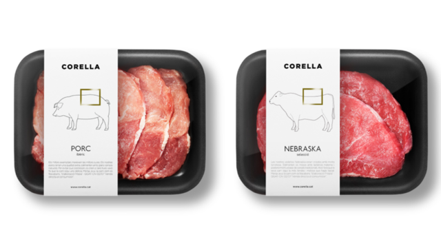
Buying meat is hard. Unless you’re a butcher or a chef, it can be difficult to tell what’s what. Does a Boston butt actually come from a cow’s butt? Where is the tenderloin? Smart graphic design can make it a little easier to answer these questions.
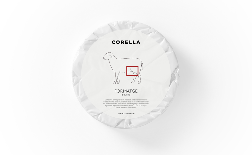
Just ask Barcelona-based design firm Fauna, which recently designed a whole new line of labels for the local butcher shop Corella. The concept is simple: Just show the consumer what they’re buying with straight lines and bold colours. The label for chicken breast, for instance, shows the outline of a chicken with a red box over the breast. Simple!
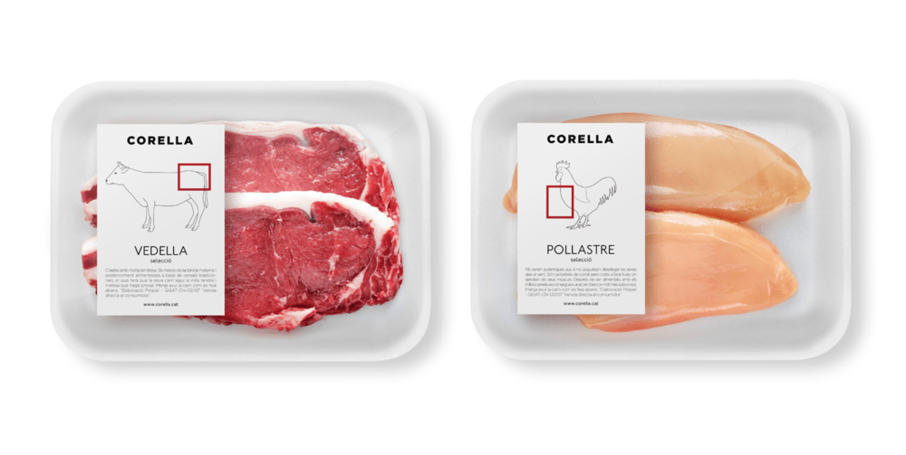
Obviously, it’s not as detailed as it could be, but that’s kind of the point. Most meat labels are a confused jumble of words and warnings, to the point where you might not even notice if you’re buying ribeye or sirloin. Why not use pictures instead?
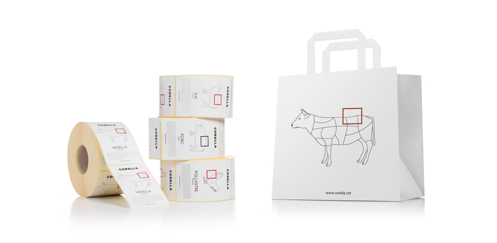
It even works with cheese — though I’ll be the first to say that these are a little bit tongue-in-cheek.
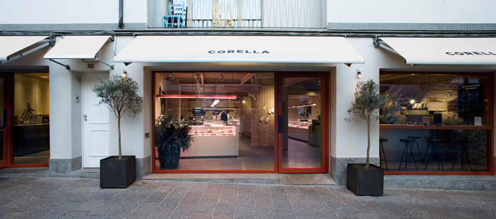
You’d expect no less from a butcher shop whose façade looks more like a fashion house than a slaughterhouse. I just hope they don’t use the labels for every meat product. Because let’s be honest: this approach wouldn’t work too well with baloney. [PSFK]