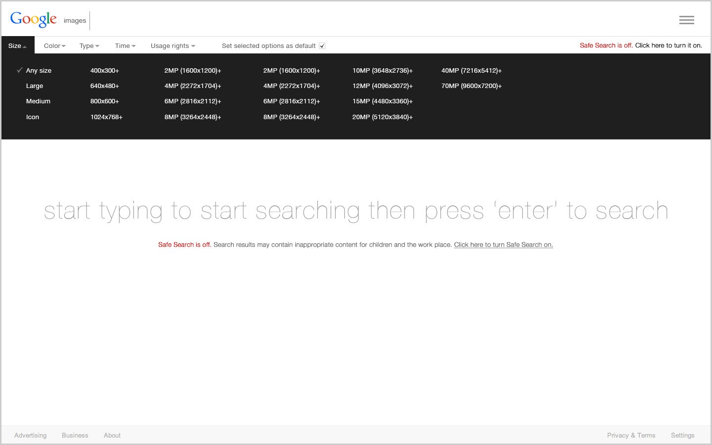
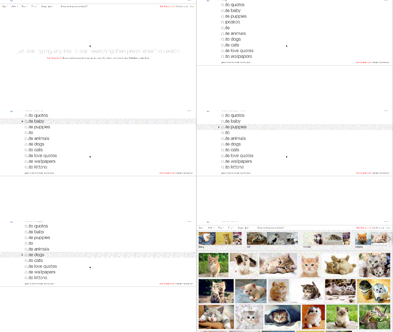
Google Images is a great product, but there are a few areas where the user experience and design could be better. So, I spent a few days refining it. Too lazy to read? Jump to the bottom and watch the video for the tl;dr.
In this first revision, I addressed only a few of the main issues I’ve come across through both user research and personal experience. To be clear, this isn’t to reinvent the Google wheel. This is purely a user-centered revision of Google Images and is continuously being updated.
Why do this? Because…

- “I was googling cat pictures and one of the ‘other’ kinds of cats were in my results. That’s when I realised the search safety was off. Luckily I spotted it before my son did.” — Jack Zhang
- “Getting hit with a gapping a*us while at work is no good man.” — Q
- “After scrolling through a mass of images, having to scroll all the way back up to the top every time I want to begin a new search is extremely annoying.” — Lynn
- “There’s no ‘page up’ button on my Mac keyboard so I have to scroll to the top every time I want to search for another picture.” — Will
- “Having to open “Search tools” to select colour and size information.” — -squishi-
- “Oh wow, I didn’t even know Google had search options like this!” — Medina
- “Why the sh*t are the search options hidden?” — Stephen
This one isn’t a gif. Stop staring at it.
So the big issues are…
- Having to manually scroll all the way to the top of the page to begin a new search after browsing through results
- The amount of steps it takes to set search options
- The inability to set search options as defaults for return visits
- The confusing status of the safe search that may result in explicit images being shown in results without the user being aware
- The clutter and process of an image result’s behaviour when clicked
These issues turned out to be the biggest for most users. Also, no users reported ever using the voice search option on desktop, so that feature has been hidden for now.
What’s been changed
This is only the first revision, so some things (such as the functionality and instructions on how to search by image, and changing search from Images to Web, Shopping, etc.,) haven’t been implemented or aren’t being demonstrated — and the positions and design of some elements haven’t been finalised. Right now what you can see though is:
- sticky search area on scroll
- click to enlarge a thumbnail, click again to minimize it
- swipe and click through to next and previous pictures
- search options displayed up front at all times
- ability to set search options as default
- more easily understandable Safe Search status
- less overall clutter
Watch the demo below and please do give feedback!
Zak Malik is a human with mutant UX, UI, Ix and IA design, ideation and beer chugging powers. He’s also the founder of 3rd Corner Studios, a boutique creative digital media agency based in Chicago and China.
