Today we learnt that popular 1990s soda/extreme sports pump-up drink Surge is back. If you hadn’t thought about Surge since the late 1990s, it was probably a trip to see that distinctive green can again. And it brought up a question: Who designed this little gem of Gen-X branding?
Now, retro nostalgia for the ’90s is a fixture on the internet, spawning memes upon anti-memes. It’s like air to a certain generation web users. But while you might feel delight at perusing old Nickelodeon GIFs, you probably didn’t stop to appreciate the design of that era. It hasn’t had a nostalgia-induced revamp. It hasn’t been revived by young designers. And it’s had precious few books written about it, compared to other eras of graphic or packaging design.
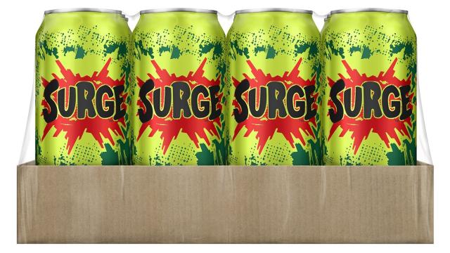
It was messy. Slimey, even. Gritty. Covered in crumbs and old hairs, like you dropped it on the floor. It had none of the sleek, gradient cool of this decade or the decades that came before it. It was kind of a mess, and the theory was, that’s why teens would like it. Surge is the perfect case study: a can the colour green of Slimer from Ghostbusters, covered in comic-style Ben-Day dots that explode outward around a cyber-font rendering of SURGE. So who came up with it?

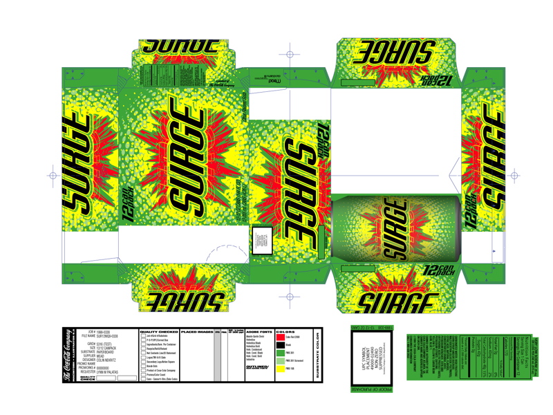
Image: Colin Nekritz.
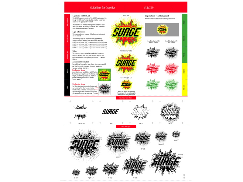
The Surge logo was designed by a team of in-house designers at Coke, according to Colin Nekritz, a Creative Director who was involved with one iteration of the design. In 1999, Nekritz worked on a project to rebrand the product that Coke informally named the “MDK,” or Mountain Dew Killer. I got in touch with Nekritz to find out how he felt about the project, 15 years later.
“They wanted to catch the wave of ‘to the XTREME’ types, skaters, snowboarders, etc., alas Mountain Dew had that demographic and segment pretty well locked up,” he wrote over email. “Coca-Cola may still be king because they’re etched in people’s minds almost synonymous with the word ‘soda,’ but I’ve a hard time thinking of the last time they came up with an original product.”

Picture: Colin Nekritz.
And so the design team at Coke was tasked with coming up with a look that would convey a lifestyle and attitude of XTREME-ness, as Nekritz explained:
I’d like to point out, every time I type ‘extreme’ I see/hear a generic air guitar whammy wail sound of the 80s-90s and someone throwing devil horns, “to the exxxtreeeeme bro!” Which of course, nobody actually did or said that, except in Bill and Ted’s Excellent Adventure or Wayne’s World, but try convincing the suits giving marching orders not to believe everything they see on TV or the movies.
The idea was to sell the too-cool-to-care attitude of Generation X to Millennial kids, and the end product was pretty much unlike anything else consumers had seen in the 20th century, which up until the ’90s had been a progression of design schools aimed at simplicity, legibility, impact.
Here was, instead, a gritty, intense alternative — one that was just as carefully calculated to convey a particular image as the pristine lifestyle illustrations Coke marketed in the ’50s. It hasn’t had a nostalgia-induced renaissance yet, but given today’s news that Surge is back, it’s probably about time.
