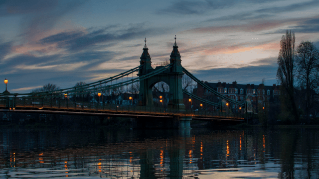
No one seemed to notice him: A dark figure who often came to stand at the edge of London’s Hammersmith Bridge under the cover of darkness in 1916. No one seemed to notice, either, that during his visits he was dropping something into the River Thames. Something heavy.
Over the course of more than a hundred of illicit nightly trips, this man was committing a crime. Against his partner, a man who owned half of what was being heaved into the Thames, and against himself, the force that had spurred its creation. This venerable figure, founder of the legendary Doves Press and the mastermind of its typeface Doves Type, was a man named T.J. Cobden Sanderson. And he was taking the metal type that he had painstakingly overseen and dumping thousands of pounds of it into the river.
Cobden Sanderson, you see, was scared. As a driving force in the Arts & Crafts movement in England, he championed traditional craftsmanship against the rising tides of industrialisation. He was a brilliant and creative luddite, and he was terrified that the typeface he had designed would be sold to a mechanised printing press after his death by his business partner, with whom he was feuding.

So, night after night, he was making it his business to “bequeath” it to the river, screwing his partner out of his half of their work and destroying a legendarily beautiful typeface forever. Or so it seemed.
Almost exactly a century later, this November, a cadre of ex-military divers who work for the Port of London Authority were gearing up to descend into the Thames to look for the small metal bits — perhaps hundreds of thousands of them — that Cobden Sanderson had thrown overboard so many years ago.
They were doing this at the behest and personal expense of Robert Green, a designer who has spent years researching and recreating the lost typeface, which is available on Typespec. As Green told me over the phone recently, the City of London had been hesitant about letting him pay its diving team to search for the lost type. “They were actually concerned that I was some crazy bloke looking for a needle in a haystack and throwing a couple grand away,” he laughs.
It’s not hard to imagine how crazy he must have seemed. A civilian offering to pay the city’s salvage divers to troll the depths of the muddy Thames, possibly for weeks, looking for tiny chunks of metal that were thrown there by a deranged designer more than a century ago? Yeah, that’s pretty crazy.
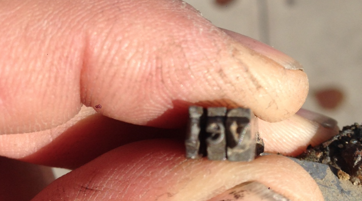
In the end, it only took them 20 minutes to find some.
Green has spent years pouring over Cobden Sanderson’s story, using what amounts to forensic psychology to understand the actions of a man who lived 100 years ago, studying how and where he would have dumped his illicit cargo. Green had narrowed it down to a small dip in the river, and it was there that the city’s divers uncovered most of their haul. “They were really into it,” Green remembers. “They wanted to find something, which they did.”
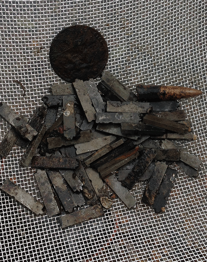
Courtesy of Robert Green.
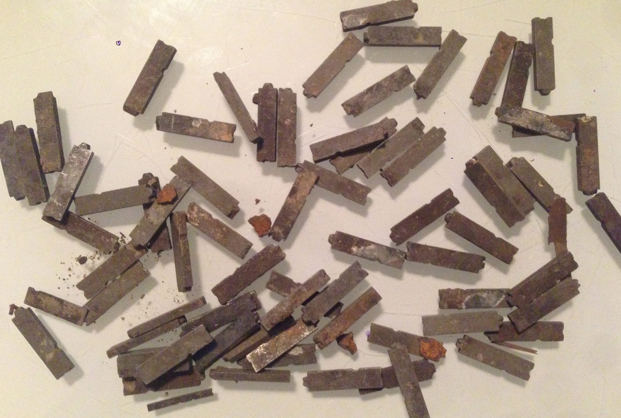
What they ended up uncovering over their two day dive was several hundred pieces of type, as documented by The Sunday Times’ Justin Quirk, who attended the dive. It was far from the full haul, either: Green points out the Hammersmith Bridge has been the target of two IRA bombings, one of which blew water 60 feet into the air after a suitcase packed with explosives was heaved into the river around the spot the type was dumped.

As a result, it’s possible some of the metal punches were blown to other locations — it’s also possible that they were embedded in concrete poured around the bridge as part of repairs.
Now would probably be a good time to explain exactly what “it” is. Today, typefaces — or fonts, as we usually call them these digital days — are essentially just little bits of binary on our computers. But the age of digital type is young, at only a few decades.
Cobden Sanderson and his partner, Emery Walker, founded the Doves Press in 1900. Walker was a businessman, with plenty of other concerns in the world, but Cobden Sanderson was a creative perfectionist — a man obsessed with authenticity and craft. Together, they commissioned a typeface called Doves Type, to be based on a 15th century Venetian type. That meant paying a “punchcutter” to create steel “punches” for each letter in the type — from which a matrix would be made by pressing a piece of copper into the metal punch. Then, the type itself could be cast from the copper matrix.
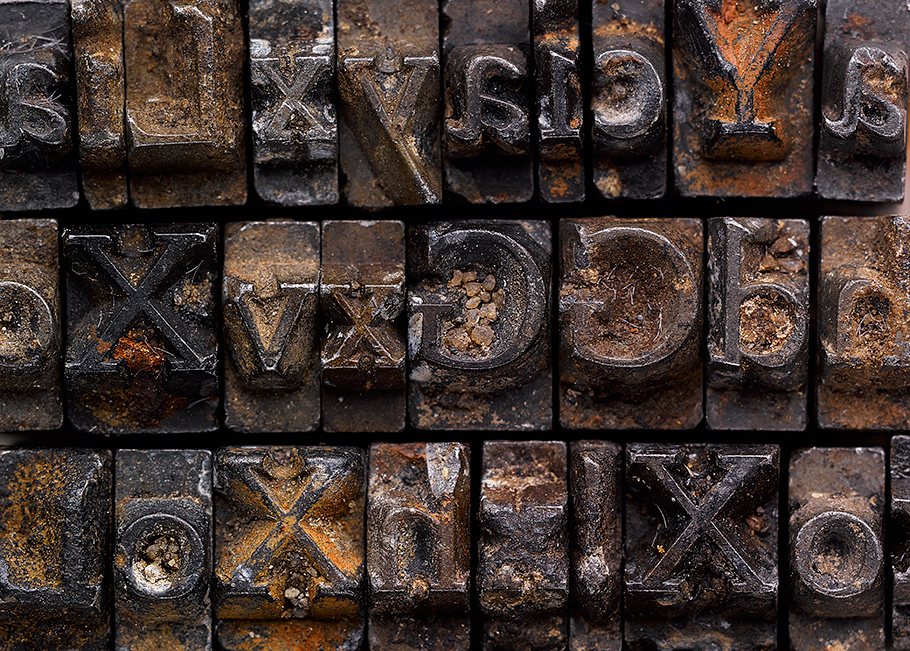
Photograph by Sam Armstrong, courtesy of The Sunday Times.
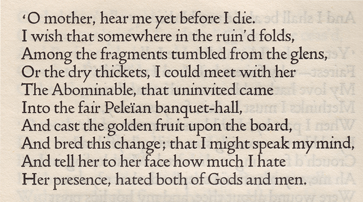
Their so-called Doves Type was created in 1899, and for the next ten years, the duo would use it to print indescribably beautiful books, bound by hand and designed with the perfect balance of craftsmanship and modern utility. As Green explained to me, Cobden Sanderson was kind of a snob — he only wanted to commit his designs to the finest literature, the “most beautiful words.” They printed Paradise lost. They printed the English Bible. Today, copies of these books are extremely rare, and they command thousands of dollars at auction.
But soon, the Doves Press was in trouble. According to TypeSpec’s own account of the partnership, Walker wanted to shut it down and divide the metal evidence — thousands of pounds of it — of Doves Type between himself and Cobden Sanderson, and for them to go their separate ways. Cobden Sanderson was horrified by the idea of letting his work go to someone who didn’t understand the value and meaning behind it — and slowly, over the course of the next few years, he formulated a plan.
Courtesy of Robert Green.
“It took him a few years to actually decide to throw away the type — he ruminated for years about whether or not he should do it,” Green says. He wrote about the process in his lengthy journals (“he would have been a bit of an oversharer” today), leaving behind detailed accounts of his inner turmoil. Eventually, he decided he’s rather destroy Doves Type than see it made into a mechanical version of its former glory. “He revelled in it,” Green says. Cobden Sanderson said it himself: “If Emery Walked wants to find it, he’ll have to dive for it.”
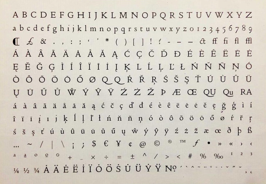
Green has spent years researching the Doves Type — he even redrew it, after thousands of hours of painstaking research work, and published his revival in 2013 as a digital typeface that anyone can buy.
But about a year ago, he says, he started wondering if there wasn’t something to be salvaged from the river. “People kept saying nobody’s ever found it,” he says. “But nowhere could I find an account of anybody searching for it.”
Which brings us to a very good question: Why would anyone search for it? What made it so special, so worth saving?
The Doves Press was a unique entity, but in some ways it mirrored what’s happening in today’s design world. At the cusp of the modern age, Doves was founded to preserve a craft that went all the way back to Johannes Gutenberg. It was also destined to fail, to end up as a weird, historical eccentricity that died out just as the mechanised printing press sprang onto the scene. It valued one thing above all others: Doing things by hand, and doing them with utter devotion to the doing.
For Green, who has worked in the design world since he was young, the Arts & Crafts’ glorification of handicraft resonates even today. “The Industrial Revolution scared the crap out of them, and quite rightly,” he says of those turn-of-the-century designers, pointing out how digitisation has further devalued the skills of graphic designers today. “A whole swathe of the middle class is being knocked out,” he adds. “You look at what’s happened to graphic design now, it’s been completely devalued and demonetised. It’s very hard to earn a living as a graphic designer.”
Now, traditional methods — like letterpress printing — are wildly popular once more among contemporary designers. “People are turning back to craft to earn a living,” says Green, a bit like Cobden Sanderson and his contemporaries did. Not only because it gives their work authenticity, he says, but also: “because it’s fun.”
It’s strange to imagine that a designer who was born more than a century after Cobden Sanderson has been the one to rebuild his ruined life’s work.
In an odd way, he’s also healing the rift between Cobden Sanderson and his partner, Emery Walker. Rather than sell the metal punches he lifted from the Thames, Green is keeping half and giving half to Walker’s family, which maintains his former home as a museum to his work. 100 years ago, Cobden Sanderson had said that Walker would “have to dive for it” if he wanted his half of the business. Oddly enough, he’s getting half after all — with Green acting as his generous, devoted proxy diver.
Today, anyone can download and buy a recreation of Cobden Sanderson’s Doves Type online. “He probably would have been horrified,” Green laughs. But then again, he doesn’t see his Doves Type as an exact recreation of the original. It’s more like an echo or a simulacrum — it has a life of its own.
It’s a story that, in a weird way, ties together the most important and controversial ideas in the last century of design. Cobden Sanderson was reacting — criminally! — to the threat of his profession being made irrelevant by the machine age. Today, designers are still struggling to find meaning and reconcile their work with a kind of machine logic born by technologies that Cobden Sanderson couldn’t have even imagined.
100 years later, the fears of a man obsessed with craft still resonate with us. But then again, without computers — a product of the machines he demonised — Doves Type would still be an obscurity. Today, it’s a living, breathing thing, an amalgam of the technologies and machines that drove its creators apart forever.
Pictures: Peter Glenday/Flickr, Dafinka/Shutterstock, Robert Green
You can read more about the revival and the story on TypeSpec or in The Sunday Times.
