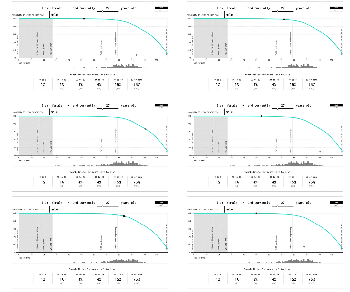
It’s a morbid question but one that we humans tend to obsess over: When am I going to die? Only a highly trained Seer can give you a firm answer, but if you want cold hard statistics, we Muggles have that bit covered.
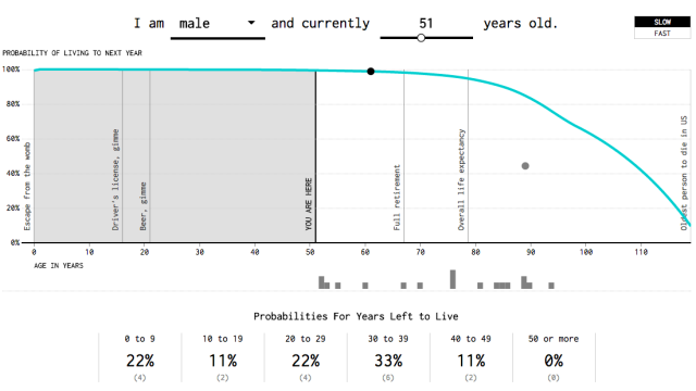
Flowing Data recently produced an enlightening interactive graphic that pulls numbers from the Social Security Administration to predict how many years you’ve got left. Each drop of a dot simulates one possible fate for a person of a given age and gender. The dots add up to create a histogram, which tells you about the probability you’ll stay on this Earth another 5, 10 or 50 years.
Of course, this is a massive oversimplification that fails to acknowledge a variety of factors which could impact your lifespan — for instance your line of work, diet and lifestyle. And remember, this tool draws on US demographic data, but lifespans vary dramatically across the world.
Knowing all this, I couldn’t help but take a peek at my own future:

While I’ve got a decent chance of hanging on another fifty years or so, something about the emotionless reality of probability distributions has convinced me that I ought to be off hiking the Andes, learning to fly planes, or having other interesting life experiences — just in case I end up in that one per cent bin. Check out when you’re (maybe) going to die over at Flowing Data.
