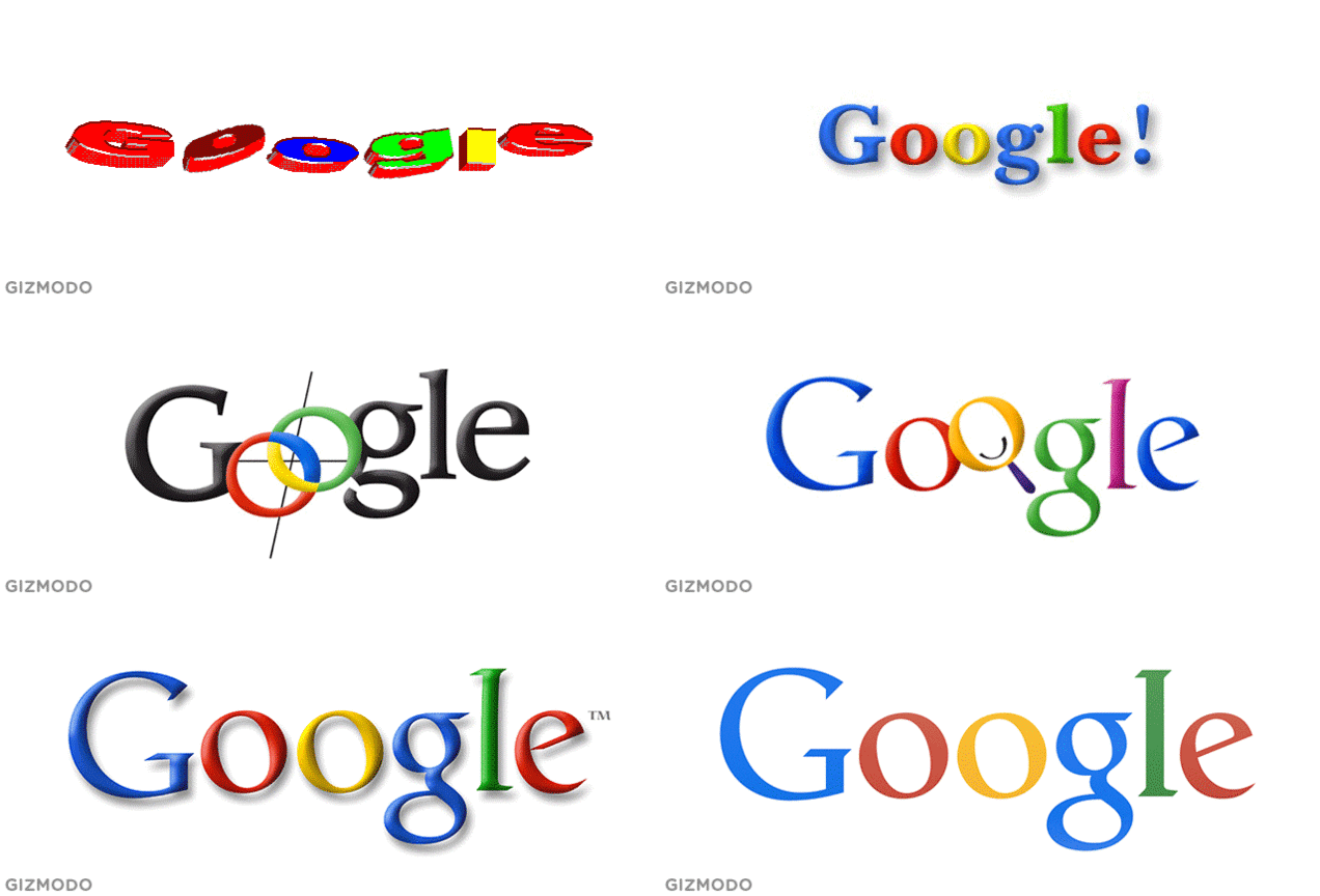
It may feel like Google’s colourful lettering has been with us since the dawn of time, but it’s been a long, bumpy road getting there. When it comes to logo design, sometimes you have to face-plant before you can fly. And in Google’s case, there’s been plenty of face-planting.
Though it would have been hard to believe at the time, what started as the sensually named BackRub would soon go on to become the behemoth that is Google.com today. Because while the BackRub logo of 1996 was nice (see below), it didn’t quite have the sort of staying power that the young Larry Page and Sergey Brin were looking for.
It wasn’t until 1997 that the Google we know today finally started taking shape. But even then, it was a far cry from the simplistic design the search giant has become famous for.
Google as we know it may only be a mere 17 years young, but in that relatively short time, its logo has experienced far more redesigns, overhauls, and tweaks than you probably realise. Let’s take a look.
1997
Google’s humble beginnings were just starting to take shape on the servers of Stanford University in 1997. And any details on the person responsible for this particular masterstroke of word art are understandably sparse. Because we’d probably be laying low, too.
1998
This more refined iteration came from Sergey Brin himself, thanks to a little help from open source image editing suite GIMP.
1999
Google decided to do a little colour juggling in 1999, in addition to taking a page out of Yahoo’s book in the form of that damnable exclamation point — the latter of which was mercifully short-lived.
1999 [concept]
By 1999, Google was finally becoming the insurmountable force we know today, and it hired designer Ruth Kedar to help them craft a logo to match. This first attempt used Adobe Garamond, with the coloured mark in the middle meant to symbolise an infinite connection. According to Kedar, “Brin and Page liked this because it looked a bit like a Chinese finger trap.”
1999 [concept]
This next concept from the batch, done in a serif typeface called Catull, tried to maintain the idea of an infinite connection, but it also attempted to incorporate something akin to a target — an allusion to Google’s precision as a search engine.
1999 [concept]
Here, a logo rendered in ITC Leawood is anchored with interlocking “Os,” mean to symbolise Google’s global reach. If it seems a bit too reminiscent of a certain Olympic staple to you, you’re not alone. Kedar thought so, too, and ultimately chucked it for that very reason.
1999 [concept]
Here we see the final product finally starting to take shape. This logo, too, was done in Catull — which would ultimately become the Google font we’ve come to know and love. This version was a bit too busy for Sergey and Brin, though. According to Kedar, “They liked the magnifying glass and the cross hairs, but not all at once.”
1999 [concept]
In another iteration, Kedar heeded the founders’ reservations and axed both the cross hairs and the see-through magnifying glass, opting for a playful smile instead.
1999 [concept]
But there was still room for Kedar to go even simpler yet — which ultimately brought her back to some of the first iterations and ITC Leawood. Here, though, Kedar brought in drop shadow to add some dimensionality to the design, making the logo appear to float over the all-white layout the founders knew they wanted.
1999 [concept]
There was a deeper reason for the founders’ preference for a simplified logo, too — one that spoke to their ambitions. By keeping the logo free of any overt search connotations, Google would be free to use the same design, even as they expanded across other industries.
1999-2010
Finally, Kedar landed on the deceptively simple winner. Catull went against the Times New Roman standard that had been set, while still keeping the readability and professionalism of a serifed font. In Kedar’s own words:
There were a lot of different colour iterations. We ended up with the primary colours, but instead of having the pattern go in order, we put a secondary colour on the L, which brought back the idea that Google doesn’t follow the rules…
…The texture and shading of each letter is done in an unobtrusive way resulting in lifting it from the page while giving it both weight and lightness. It is solid but there is also an ethereal quality to it.
2010-2013
This relatively brief revamping saw brighter colours and subtle shadow reduction. And though it’s now largely been replaced, it can still be seen on some Google sites as a nostalgic Ghost of Google Past.
2013-2014
Finally, we’ve reached the logo of today. Last year, Google finally gave in to the overwhelming demand for flat everything, choosing to soften some angles and making the logo easier to read at smaller sizes.
This newest iteration has stayed more or less the same since its first appearance, despite the occasional tweak. But given how wildly familiar the Google logo has become, any tweak at all is bound to be noticed — even if it’s just a single pixel.
2015
And, of course, we now have a new (serif-less) iteration has been newly minted.
