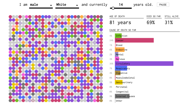
You’ve already found out how you might die — but when’s it going to happen? This visualisation of data from the US Centres for Disease Control and Prevention should give you a better idea.
Created by Nathan Yau from Flowing Data, the interactive visualisation takes your sex, race and age, then simulates how things might play out for the rest of your life — or what there is left of it. Yau explains how it works:
Each dot represents one of your simulated lives, and as each year passes, more of your simulated selves pass away. Colour corresponds to cause of death, and the bars on the right keep track of the cumulative percentages. By the end, you’re left with the chances that you will die of each cause.
Shift age to the older years, and let the simulations run. You’re much more likely to die of a disease rather than something external. Shift past 80 years, and it’s over 40 per cent chance the cause will be circulatory, regardless of demographic group.
So what are you waiting for? Find out when you might die according to data.
