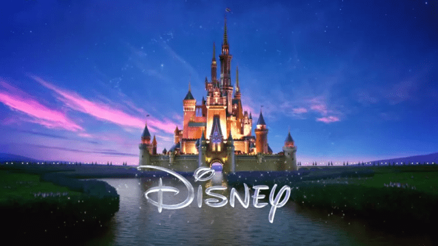
A modern take on the Disney Pictures logo, still with that weird squiggly D. Tell me that’s not a J. Why is that not a J?
So, what’s the deal with the ‘D” in the Walt Disney logo, anyway? It’s got this odd squiggly flair to it that’s kind of hard to read. That’s just Walt’s signature, right? Well, actually, it’s a bit weirder than that.
As it turns out, no, it’s not his signature. At least, it’s not representative of his signatures, of which he had many. And as to why Disney picked the hard-to-read one, and not another? It’s not clear. And did you know that Disney didn’t even settle on that logo until the 1980s?
This info comes from prominent YouTuber Hank Green, who decided to do some digging into the life and times of the mysteriously not-quite-readable Disney Pictures logo. His results are fascinating, and a bit unsatisfying. Why did Disney pick that D? Is the company just trying to confuse the children of the world? Because it’s working. It’s working.
And, for fun, here’s another YouTuber’s take on the question, from humorist ProZD.
