Everyone has an Google have been shifting to their custom Helvetica-esque-but-not-quite fonts to deal with some of its quirks.
Rather than let Helvetica die a slow death, all 40,000 characters in the world’s most iconic typeface have been revamped into a new font called — wait for it — Helvetica Now.
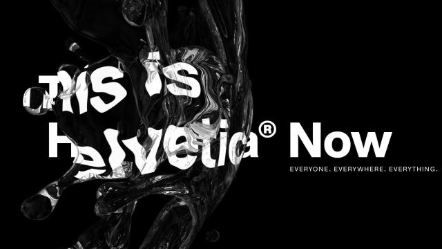
“This is not a revival. This is not a restoration,” writes Monotype, the company which owns the licensing rights to Helvetica. “This is a statement. This is Helvetica Now: for everyone, everywhere, for everything.”
O-kay then. Let it be said that typeface designers are a dramatic bunch.
Some of the issues with Helvetica centered around uneven kerning—the spacing between letters—and readability issues at small sizes. That introduces challenges when it comes to meeting modern tech needs, like resizable browser windows and smaller screens. To address those issues, Helvetica Now will be available in three sizes: Micro, Text, and Display. According to Monotype, Micro is meant for smaller screens and lower resolutions, like what you might find on tablets and smartwatches. Meanwhile, Display evens out kerning for larger sizes, like a billboard, while Text is designed for “visually crowded environments.” (Ostensibly, something that’s very text heavy like a textbook or an article.)
The last time Helvetica was updated was in 1983 with Helvetica Neue, which is basically the version of the font you’re probably most familiar with. As for how it differs with Helvetica Now aside from sizing, it’s mostly minor design tweaks. Changes include clarifying the difference between a lowercase l and a capital I, as well as an updated @ symbol. Helvetica Now also includes a straight-legged R, a single-story a, “lowercase u without a trailing serif,” rounder punctuation and a rounded G.
For now, you can explore what Helvetica Now looks like on Monotype’s website. It’ll take a bit before Helvetica Now completely replaces its predecessor, however. Companies will still have to licence the font from Monotype, and that could take some time. Chances are, unless you’re super into design or typefaces, you might not notice any difference at all.