
We all like to complain about our Internet speed, partly because it’s so annoying when your connections are flaky, and partly because it’s near impossible to escape that sneaky feeling that somebody out there has it better than we do.
If you live in New South Wales, you can now quantify your Internet speed in relative terms, with the NSW State Government opening up its Digital Connectivity Index to provide a measure of the quality of digital connections across the state.
What Can I Do With The Digital Connectivity Index?
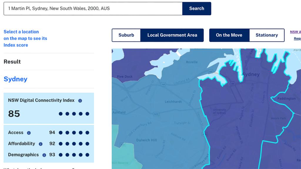
If you happen to be an approved user by the NSW Government, there would appear to be more granular data available with a login, but anyone can head to the Digital Connectivity Index web site and enter a standard street address to get a snapshot of their suburb or LGA’s Internet speeds on demand, with filtering available for fixed line and mobile broadband quality.
What you’ll then get is a colour-coded indication for quick reference, as well as three scores: Access, Affordability and Demographics.
What you ideally want to see there are scores at least hitting 61 or above, which indicates – as per the digital index website that
“Communities with these scores are likely able to meaningfully conduct digital activities such as working, video conferencing and accessing telehealth.”
So for example in the screenshot above – checking how good the internet connectivity is at the post office in Sydney’s CBD – we can see that it sits rather comfortably in what the index refers to as the “excellent” band for all three scores.
Whereas if you shift your focus to, say, Oaklands in the Riverina region, digital connectivity is a considerably more challenging prospect.

One caveat here is that while the data is claimed to have been assembled from some 220 million data points, it’s not being calculated and displayed in anything near real-time. While it is continuously updated, it’s primarily based at this time on data from 2022.
The intent here is not so much enviable neighbour-suburb voyeurism, but instead as a tool to help guide investment and development decisions at a government level looking to the future. Like, perhaps – and it’s just a suggestion – getting the good folks of Oaklands some better connectivity at some point. That would be nice.