If you’re an IT security nerd specialist holed up in some corporation’s basement, you probably don’t find this real-time visualisation of the world’s cyber attacks to be beautiful. But the rest of us can sit back and appreciate the eye candy.
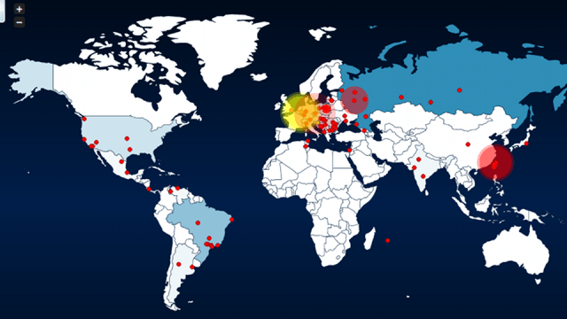
All of the red dots on your on HoneyMap represent locations that are currently under cyber attack, and the terminal-like ticker at the bottom of graphic tells you where all of the attacks are coming from. The data is collected by “honey pots” (the yellow dots) set up by the Honeynet Project, a volunteer non-profit organisation that’s trying to find ways to combat global computer security threats like malware.
If they can make cyber attacks look this beautiful, we only hope they can find ways to make the absence thereof as aesthetically satisfying. [Honeynet Project via Atlantic Wire via BetaBeat]