infographics
-
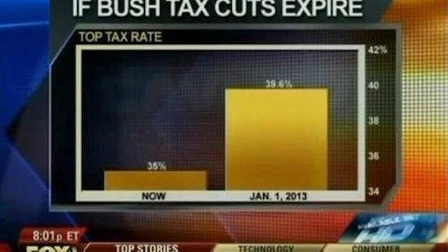
How To Lie With Data Visualisation

Data visualisation is one of the most important tools we have to analyse data. But it’s just as easy to mislead as it is to educate using charts and graphs. In this article we’ll take a look at three of the most common ways in which visualisations can be misleading.


-
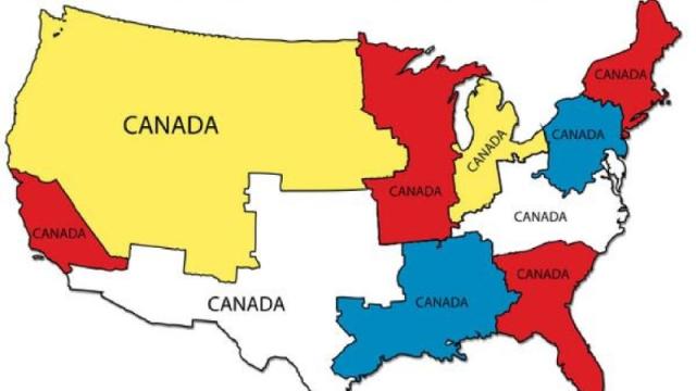
Let’s All Cool It With These Stupid Maps
Maps are great. Maps help us get where we need to go and can sometimes teach us things about the world we live in. But unfortunately, the internet has been infected by a scourge of stupid maps. And stupid maps are making us dumber.


-
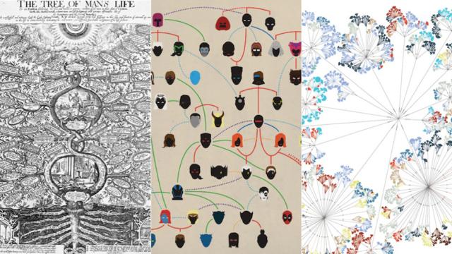
14 Complex Data Visualisations That Take The Form Of A Tree

Infographics might seem like a modern phenomenon — citizens of the internet love nothing more than a nice and tidy presentation of catchy stats — but data viz dates way, way back. In The Book of Trees: Visualiing Branches of Knowledge, interaction designer Manuel Lima examines a recurring theme: more than eight centuries’ worth of…


-
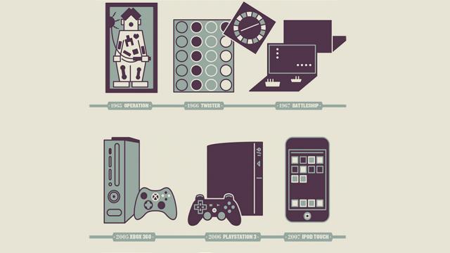
This Infographic Shows How Crazy Christmas Toys Have Gotten In 50 Years
Philadelphia-based Abby Ryan Design came up with this fun infographic of the most popular toys from 50 years of Christmas shopping. If you were a child during any of that time, you’ll doubtless recognise something. Then you’ll scratch your head in bafflement at how damned expensive today’s most-requested gifts are.