type
-
Do Digital Typefaces Really Need To Be Different Than Print? Not According To This Designer
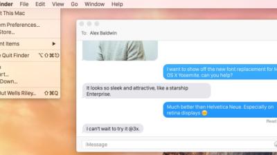
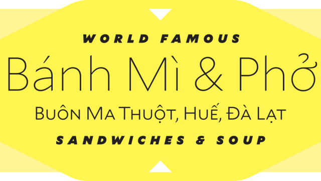
There’s been plenty of talk lately about why certain typefaces are better (or truly awful) for our increasingly screen-based reading. A new typeface by celebrated typographer Tobias Frere-Jones is designed to elegantly bridge what is perceived to be a growing gap between print and digital worlds.
-
Google’s Logo Killed Serifs Because Serifs Had It Coming
Google debuted a serif-free logo today — the first real change to its logo since 1999. And although it’s much prettier than the 16-year-old wordmark, the company claimed it was more about functionality than looks. The Google logo has become more and more problematic throughout its existence, and it had everything to do with those…
-
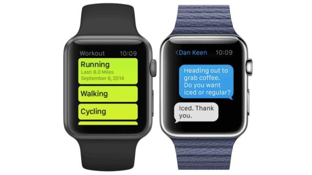
Apple Debuted A Brand-New Custom Typeface With Its Watch
Something I was watching closely as the Apple Watch was revealed today: Which typeface would grace this shiny, tiny new device? Well, it’s not Helvetica, the troublesome font that Apple recently adopted for its iOS and OS applications. It’s a brand-new typeface that was designed for excellent readability — by Apple.
-
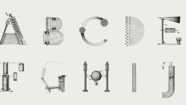
An Intricate Typeface Made Out Of History’s Greatest Inventions
When she was a design student, Khyati Trehan embarked on an ambitious project to highlight history’s 26 most influential inventors with a unique alphabet. Remarkably, each letter of the special typeface is drawn with a world-changing invention while also name-checking the inventor. The letter “E,” for instance, is represented by the phonograph invented by Edison.
