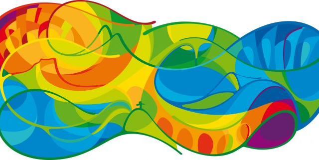
Hundreds of thousands of people attend the Olympics, and millions more watch them. So there’s a lot riding on the way a city presents them, from advertising to stadiums. Rio just revealed what its 2016 Games will look like, and it’s done a great job — not just because no enterprising internet perv has compared it to a lewd gesture. So far. I know you’ll get there, guys.
According to the city’s in-house team of designers, it took more than a year to develop the comprehensive graphic system that will coat everything from tickets, to advertising, to the venues themselves. They were right to go slow: Even Brazil’s recent World Cup branding scheme was dogged by jokes, after commenters pointed out that it looks just like someone facepalming. Add that to other recent cautionary tales, like London’s robot sex logos or the creepy mascots of yore, and you can understand why Rio decided to take its time.
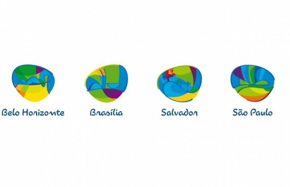
Brand New has the scoop on the designs, which show an amoeba-like swirl of colour and form, borrowing language from Brazilian legends like architect Oscar Niemeyer, whose sinuous buildings are clearly readable in the morass of lines and shapes.
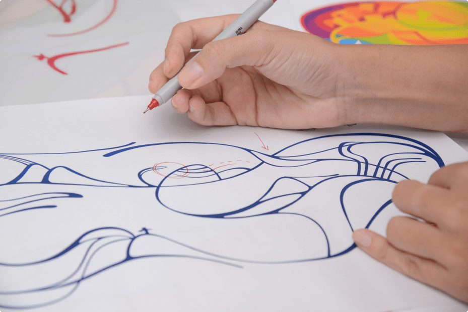
In a press release translated from the Portuguese by Google, the designers explain how the images are drawn from “people, places, pictures, monuments, colours, smells, sensations,” and how the look is “organic and immersive ‘like a hug’, inspired by the exuberant nature and warmth.”
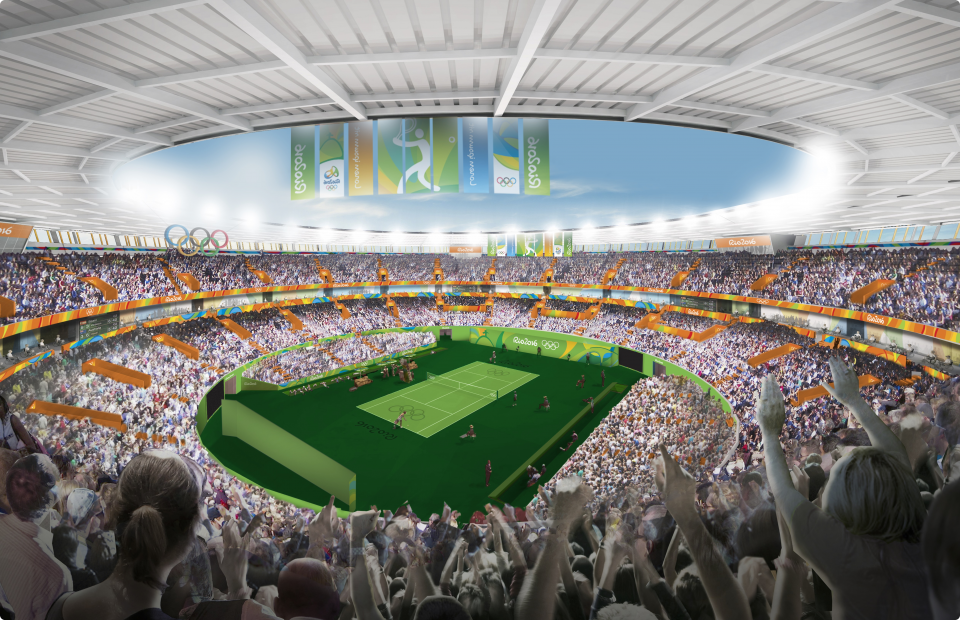
The amoeba is a jumping off point for other aspects of the branding, like logos for the cities in which events will take place, as well as an incredible amount of physical advertising and infrastructure, including the paneling that will decorate the stadiums and venues.
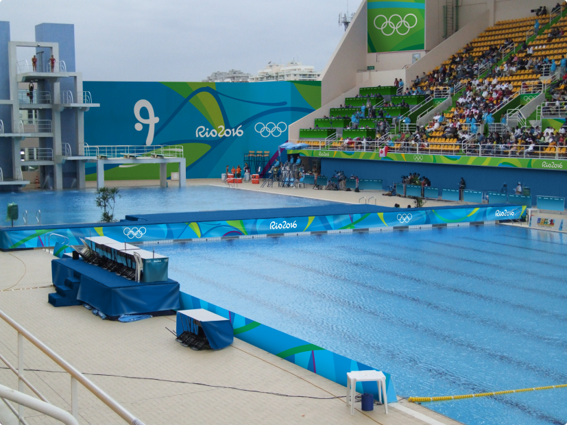
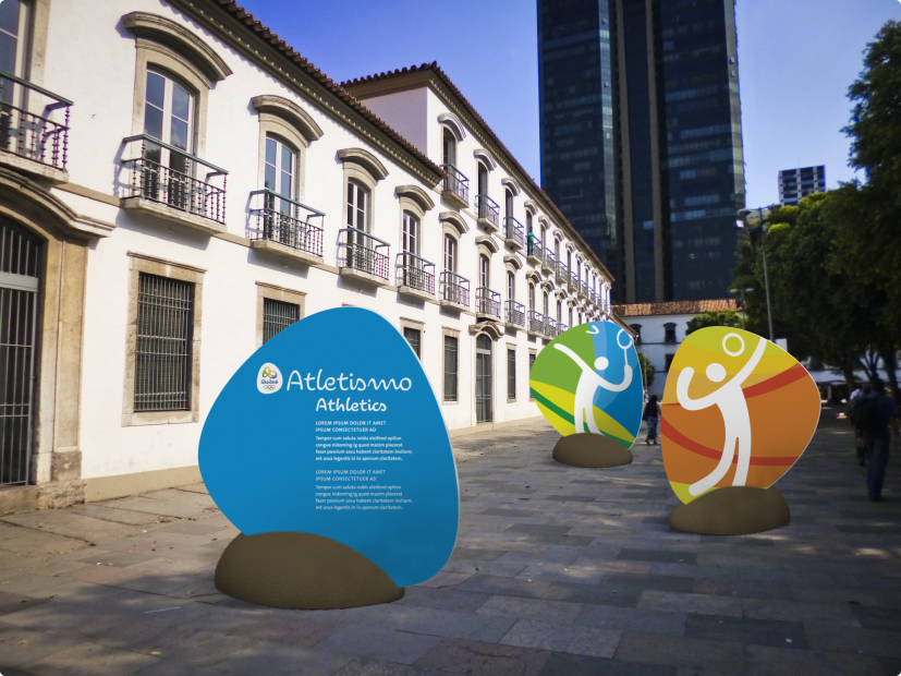
A project like this can seem deceptively simple from the audience side of the picture. After all, how difficult could creating a set of city logos and colours really be? In fact, it’s an incredibly complicated task. Consider that these images, forms, and words are going to be used on things as big as whole stadiums, as well as things as small as souvenir pins, while remaining legible. And in thousands of other applications, it will appear on oddly-shaped signs, clothing, TV, millions of screens, and of course, paper.
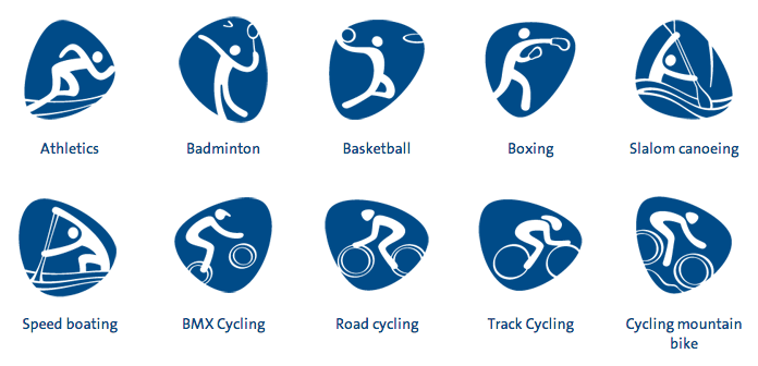
All the while remaining recognisable and, hopefully, evoking nothing other than the Olympics — and charm of Rio, of course. As Brand New‘s Armin Vit points out, it isn’t blow-your-mind great. But the team has two more years to work out any kinks and finalise its design. But as a first draft for a massive project heaped with historical failures goes, it couldn’t be better. [Rio 2016; Brand New]
