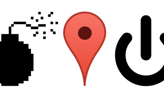
The original Mac OS icons. The Google Maps pin. The power-on symbol. These marks, which have been with us for years on our screens (or decades, in some cases), are all on display this month at the Museum of Modern Art.
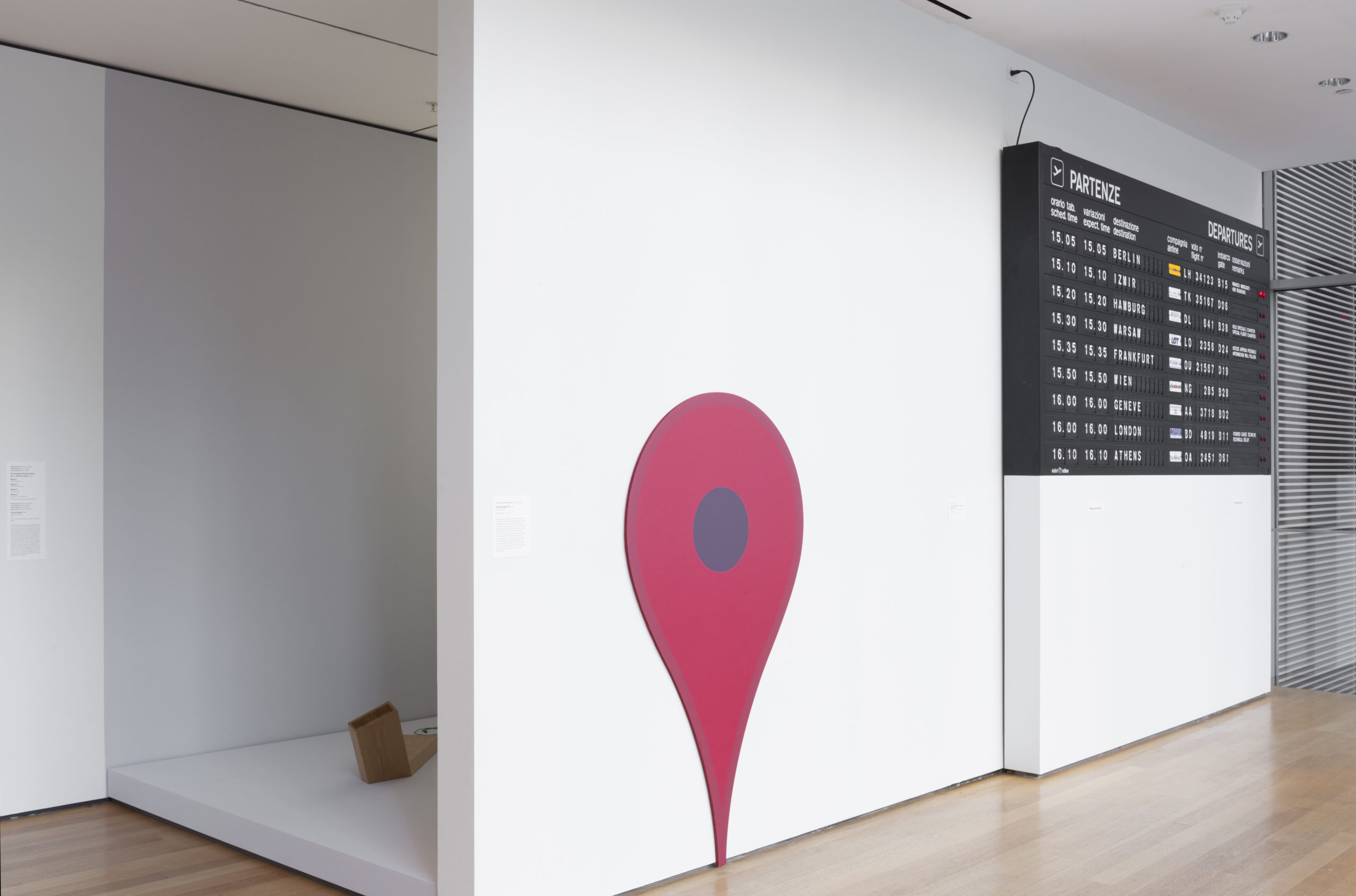
In the balcony of MoMA this year, you’ll find a collection of icons and symbols pulled from across the web. It’s all part of an exhibition called This is for Everyone: Design Experiments for the Common Good that will run until January of 2016, and it’s the product of MoMA’s curator of architecture and design Paola Antonelli, who has spent the past few years acquiring everything from video game consoles to circuit boards for the museum’s permanent collection.
So the things we see on our screens every day are now on the walls of one of the most respected modern art museums in the world. There’s been plenty of debate on whether they deserve to be there — but for sure, it’s exciting to see UI design being thought of as part of conventional design history. More details on a few of the most interesting icons, below.
The Power (Standby) Symbol
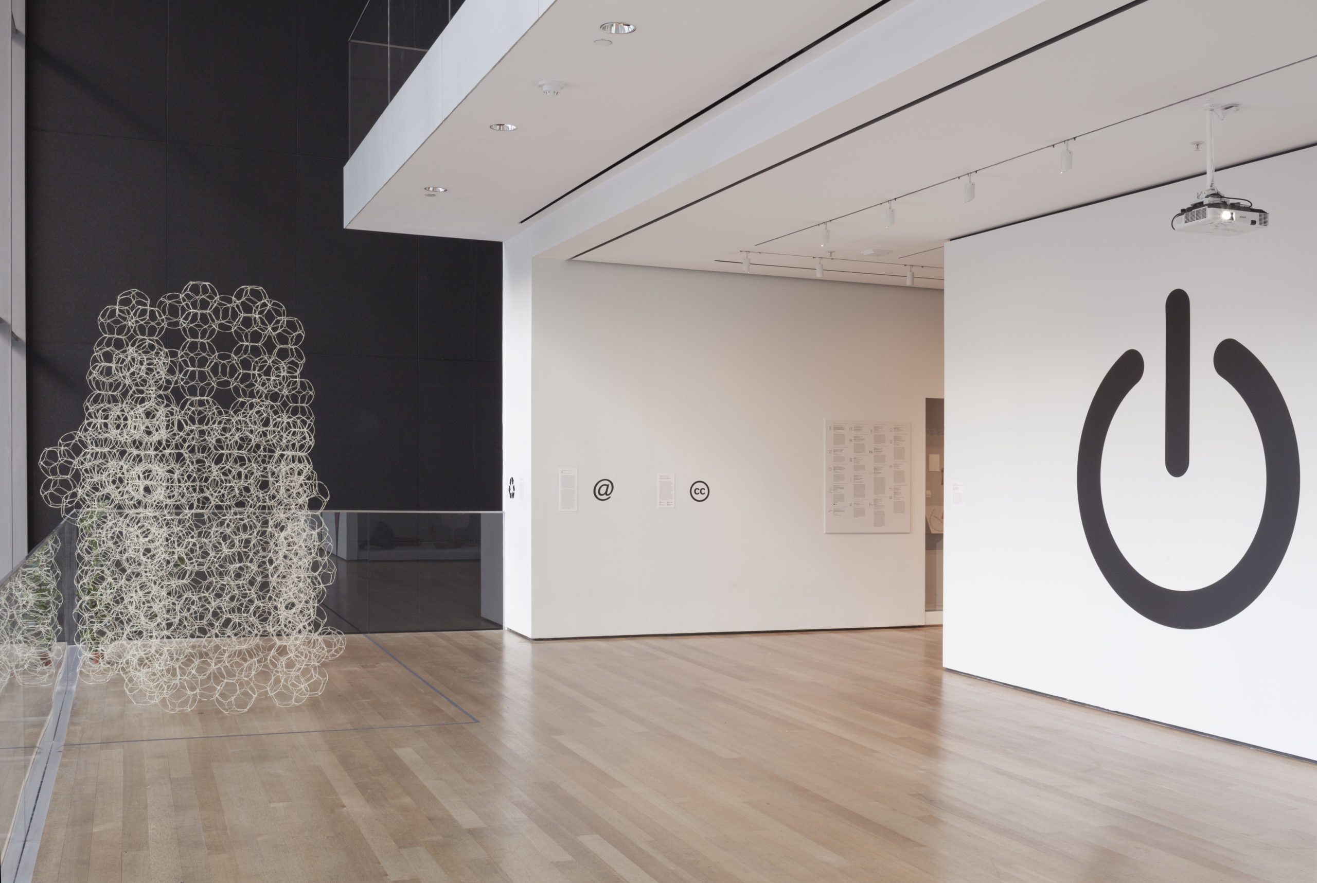
What we think of as an “on/off” switch is actually the result of a century of user interface design. You see, there’s a Switzerland-based International Electrotechnical Commission (founded in 1906!) that maintains guidelines that dictate the symbols that companies use on their products — it’s a “sister” organisation to the ISO, in its own words.

That includes creating standards for symbols like on and off — which, for decades, it defined as a zero and a one for on and off. But here’s what so cool about our current symbol: It evolved along with technology. As more machines could be “on” without truly being active — e.g. standby — the IEC decided to merge the two symbols to create a tertiary “standby” symbol. Over time, it’s evolved to mean “power”, but it’s still cool that it represents the evolution of personal computers too.
The Original Mac OS Icons
We’ve written about graphic designer Susan Kare‘s original pixelated icons before — Kare is the artist and designer who designed a huge amount of the symbols you’d find on the GUIs of early Macs, from typefaces to app icons.
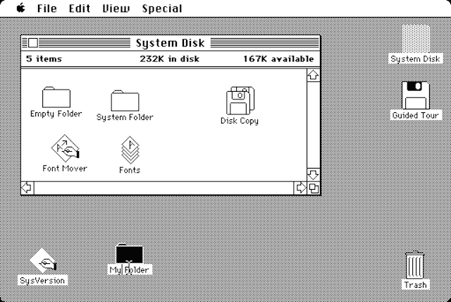
In the MoMA show, Antonelli has put Kare’s actual notebooks on display. They contain the original sketches Kare did to create the Mac icons, from the mailbox to the scissors. Here’s what Antonelli has to say about them:
Her process, part of which occurred just a few weeks before she was officially hired at Apple, is documented in graph-paper sketchbooks. Using one box to equal one pixel, Kare designed intuitive icons for various functions a computer user might undertake (for example, a pair of scissors symbolized cutting text). The pictogram icons were designed to be an instinctive language that could be understood and loved by users in many different countries.
It’s amazing to imagine what it was like for Kare, then just entering into the emerging industry of personal computers, to sit down and draw out what would become some of the most familiar shapes and symbols of any user interface ever. We’re still using some form of most of these icons, after all.

Top image by Wikipedia user Tene; Bottom by Chrissy Wainwright
The Google Maps Pin
Google’s red teardrop icon has taken on a life of its own: It’s inspired gift of Google Inc.,” though, so it sounds like the acquisition came straight through the search giant.
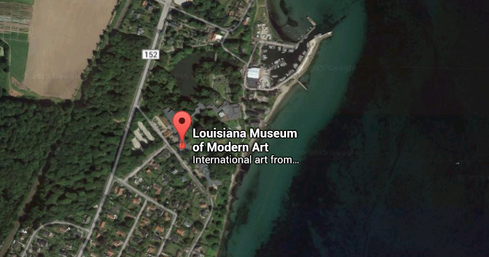
The New York Times actually asked Google about the pin’s distinctive design back in 2011, and found out its shape stems from legibility issues. A Google spokesperson told the NYT that Rasmussen “avoided putting a dot or star flat on the map because it tended to obscure the area.”
There are plenty of other fascinating stories behind MoMA’s new tech acquisitions — go check out the show if you’re in New York over the next year.
Pictures: MoMA unless otherwise noted.
