NYC’s New Subway Stations Feature A Twist On Its Famous Typeface

NYC’s New Subway Stations Feature A Twist On Its Famous Typeface

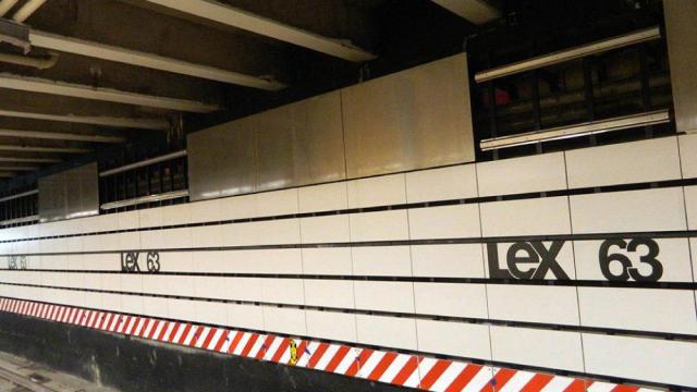
Hip is seldom a word used to describe the look of the New York City subway. But new images of the graphic design that will grace some of the new Second Avenue subway stations look pretty damn cool — especially for Midtown. Nothing like a little play on Helvetica to catch a hipster’s attention.

We reached out to the MTA for more information on the station design but a representative claimed they were not ready to provide more details. Interesting. Until then, check out more photos of (mostly unfinished) Second Avenue stations at Gothamist.

Picture: MTA

The Cheapest NBN 50 Plans

It’s the most popular NBN speed in Australia for a reason. Here are the cheapest plans available.

At Gizmodo, we independently select and write about stuff we love and think you'll like too. We have affiliate and advertising partnerships, which means we may collect a share of sales or other compensation from the links on this page. BTW – prices are accurate and items in stock at the time of posting.