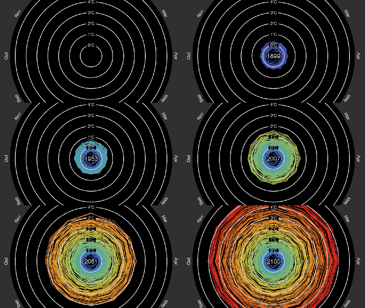
Climate change is real, it’s happening right now, and it’s pushing us into an increasingly grim-looking future. Still don’t believe it? Take a look at this graph.
Earlier this month, climate scientist Ed Hawkins put out one of the best visualisations we’ve seen of the changes in global climate over the last 160 years. Instead of depending on a simple line graph, Hawkins created a visually-arresting climate spirograph showing how — despite small variations between individual months — we’ve moved a long way from our baseline temperatures in 1850.
Now, the USGS has made a new visualisation that projects Hawkins’ graph out past the present and into our hot, dusty future. So far, we’ve climbed almost a full 1.5C since 1850 — most of that in just the last couple decades. The USGS’ Jay Alder used the IPCC’s future climate projections of what happens if our current carbon emissions rates continue to rise unchecked. The new visualisation tacks an additional 84 years onto Hawkins original graph, depicting the nightmarish scenario in which global temperatures rise almost 5C by the end of the century.
Of course, this projection is what happens if we don’t change our ways. There’s still a chance now for us to cut back emissions and prevent the increase in temperature from being so dramatic. Cutting-back won’t be easy, though. It’s going to take resources, money, time and, perhaps most of all, a firm global commitment to the fact that climate change is real.
