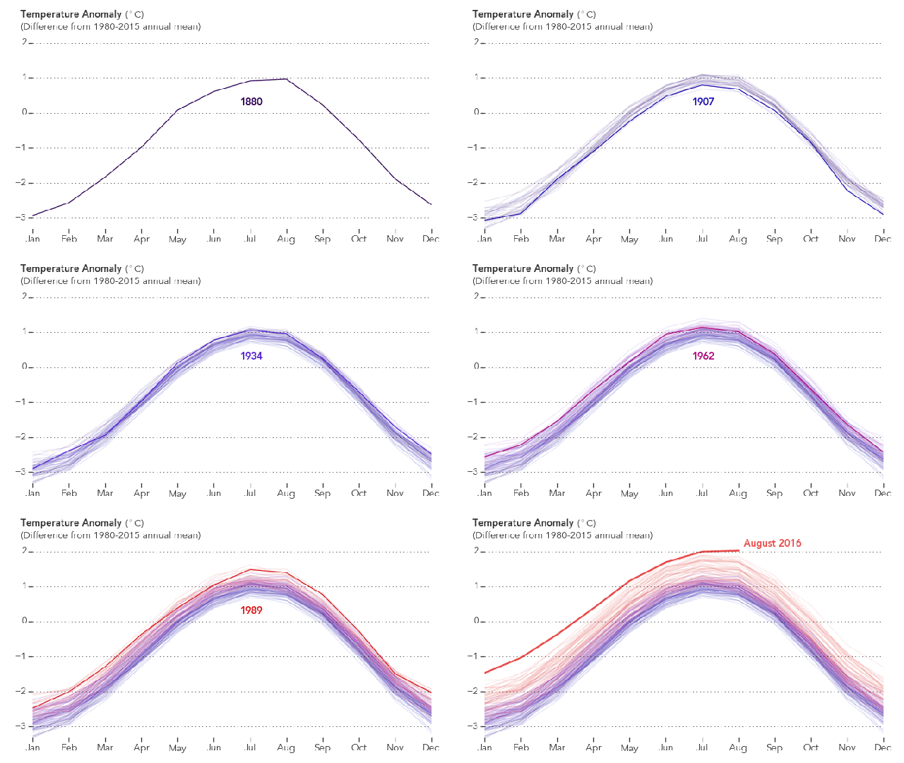
We just had the warmest August on record, which also tied last month for the warmest month ever recorded. But it’s the overall trend that’s truly scary, and now you can watch it unfold right before your eyes.
NASA’s Earth Observatory put together this GIF using measured differences over mean recorded temperatures for every month of the year for the last 136 years. When it starts in 1880, you can see the line inching upwards and occasionally falling back over itself. But then, somewhere before the 1990s, things start to swing upwards fast, so much so that, by the time it reaches its peak this August, the year’s line can be seen pretty much by itself.
It’s a stark look at just how far our temperatures have really risen over recent decades — and what we can expect to come in the future.
