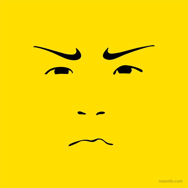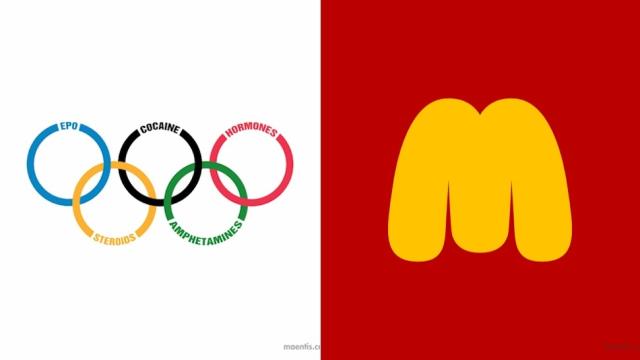
Most company logos usually play it pretty safe: stale stencils or vanilla graphics mixed with a bunch of nothingness to keep uniqueness to a minimum. That’s never fun. But if you get too adventurous, the internet skewers you. That’s why we’re left with logos and brands that pretty much are all different degrees of the same. Design studio Maentis wasn’t happy with all that sameness, so it took the famous logos and brands we see everyday and created painfully honest (and hilarious) parodies.
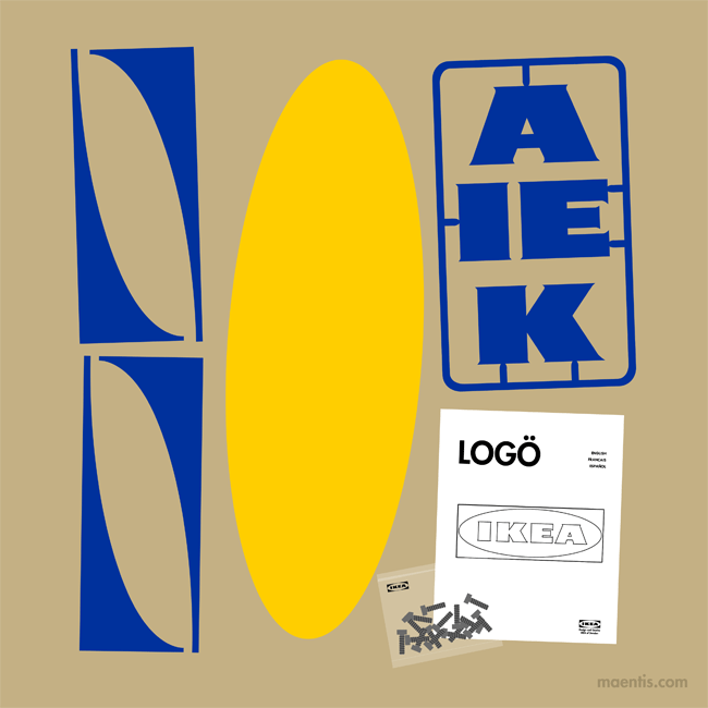
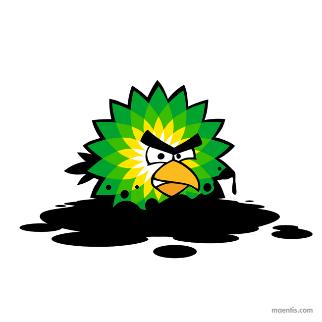
So you get an obese angle-less M for McDonald’s. An IKEA logo that you have to make yourself. A BP logo drenched in oil. And the Olympic rings representing drugs and sex. It’s awesome. [Maentis via Design TAXI]