iCloud Is About To Look A Whole Lot More Like iOS 7

iCloud Is About To Look A Whole Lot More Like iOS 7

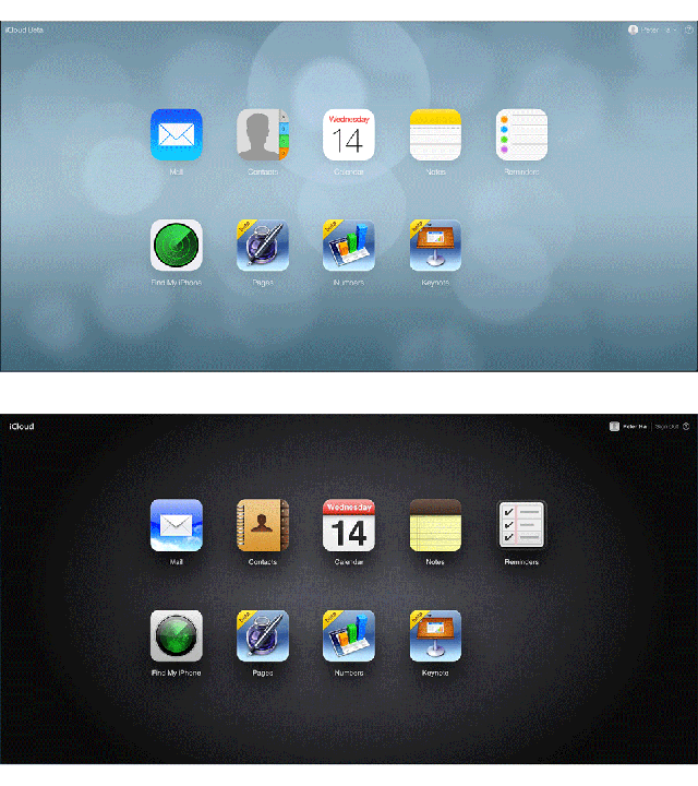
The slow creep of Jony Ive’s flat-friendly software design is starting to pick up its pace with the new beta version of iCloud.com. That scratchy old black background is now dreamy blue and blurry just like iOS 7. The app icons have lost a dimension as well, and they now look like their iOS 7 counterparts. Frankly, it looks lovely.

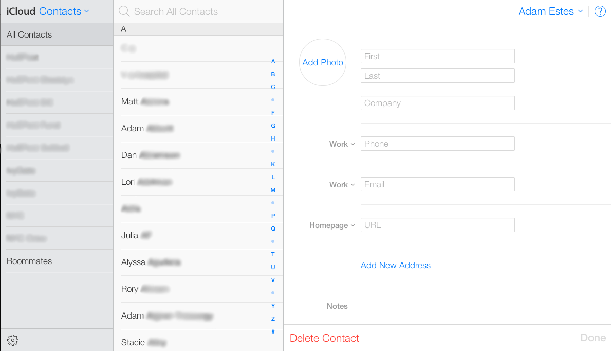
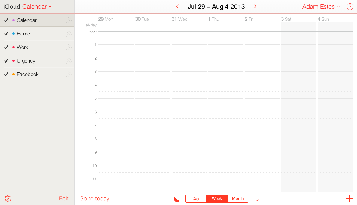
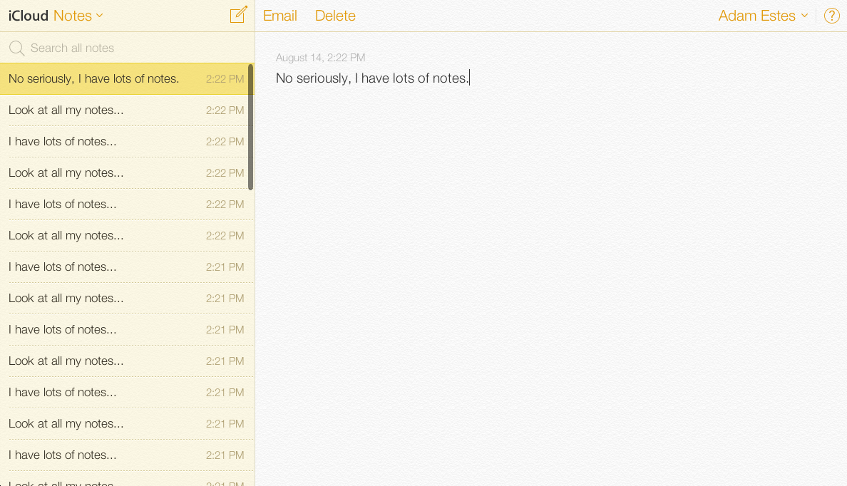
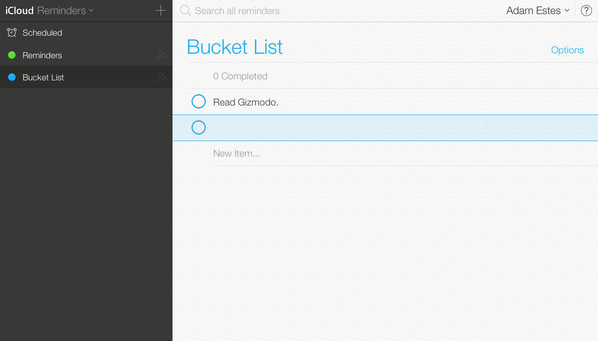
The redesign doesn’t just stop at the home screen. Clicking through shows that all of the apps (except Pages, Numbers and Keynote) have the same flat design and clean lines that will soon grace all iOS devices. Indeed, it’s pretty impressive to see the new design spread out in a bigger format.

If you have a developer account with Apple, go to beta.icloud.com to see the new view yourself.
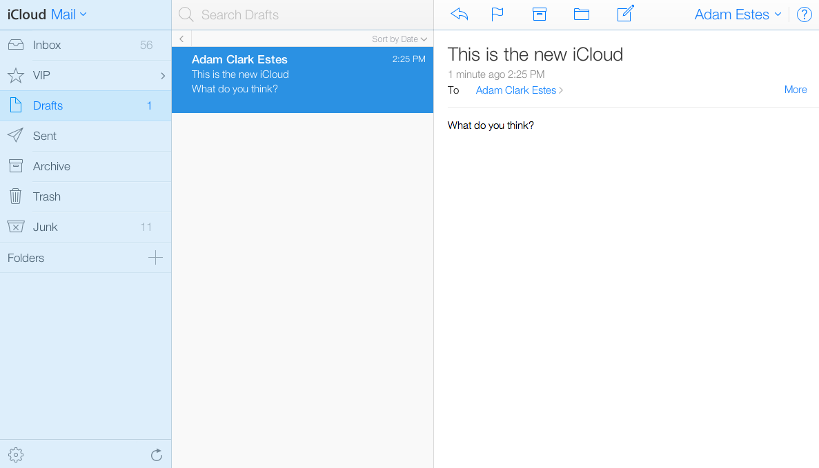
Mail

iCloud Is About To Look A Whole Lot More Like iOS 7

Contacts

iCloud Is About To Look A Whole Lot More Like iOS 7

Calendar

iCloud Is About To Look A Whole Lot More Like iOS 7

Notes

iCloud Is About To Look A Whole Lot More Like iOS 7

Reminders

iCloud Is About To Look A Whole Lot More Like iOS 7

The Cheapest NBN 50 Plans

It’s the most popular NBN speed in Australia for a reason. Here are the cheapest plans available.

At Gizmodo, we independently select and write about stuff we love and think you'll like too. We have affiliate and advertising partnerships, which means we may collect a share of sales or other compensation from the links on this page. BTW – prices are accurate and items in stock at the time of posting.