infographic
-
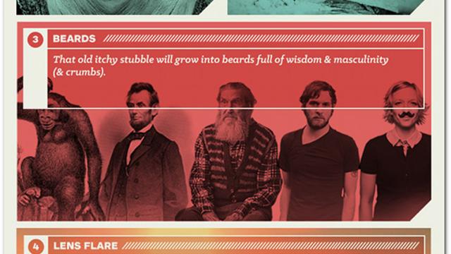
Here’s What Marketing Could Look Like In 2014

Since 2014 is only a few days away, design aesthetics probably won’t be stunningly different come the new year. So that’s all the more reason to make some predictions! Let’s do this.
-
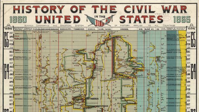
This 100-Year-Old Infographic Maps The Entire American Civil War

Back in the 1930s, the infographic scene was already humming with crazy products like the Histomap and its 4000 years of visualised history. But the roots of infographics go back even further. This intense visual recollection of the Civil War dates back to the 1800s.
-
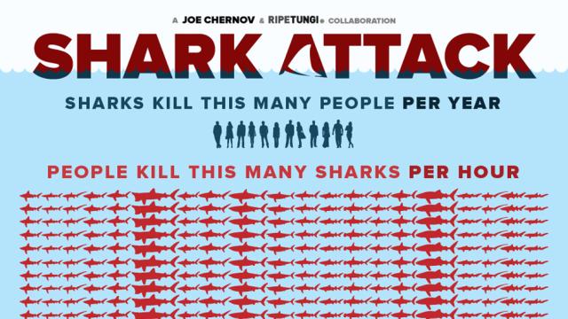
Get A Sense Of How Dire Shark Finning Is From This Visual Representation
One thing infographics are really good for is providing a sense of scale. Certain numbers are just too big to really comprehend, and can also be made to sound bigger or smaller than they actually are depending on how they’re presented. Let’s take shark finning as an example.
-
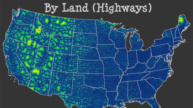
Where Exactly Is The Middle Of Nowhere?
We’ve all said it or thought it or joked about it or believed it at one point in our lives. That damn, we were in the middle of nowhere. But that dark stretch of highway hardly qualifies as nowhere. True nowhere is actually in Idaho.