A few weeks ago, Facebook began rolling out an opt-in survey for people in the U.S. to self-report their covid-19 symptoms to help Carnegie Mellon researchers identify infection hotspots. Today, the researchers have launched a website for their findings, while Facebook has turned the aggregated data into an interactive symptom map.
Carnegie Mellon University’s COVIDcast site aims to provide covid-19 “forecasts” several weeks in advance and is built on self-reported data from Facebook, Google, diagnostic test provider Quidel Corp., and other unspecified partners. The idea is that forecasting will help hospitals, first responders, and health officials better anticipate how many hospital and ICU beds they may need. According to CMU’s blog, the site will begin featuring heat maps later this week and will combine survey results with other data, including medical claims and testing. The researchers note that they’ll be adding five additional data sources in the next few weeks. As of right now, the CMU researchers say they have “good coverage fo the 601 U.S. counties with at least 100,000 people” and receive roughly 1 million responses a week from Facebook users, plus another 600,000 from Google and AdMob apps.
[referenced url=” thumb=” title=” excerpt=”]
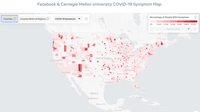
While CMU’s maps are not live yet, Facebook’s symptom map is—though it comes with several disclaimers. Notably, the map does not display confirmed positive cases of covid-19; it’s an estimated percentage of people who have reported symptoms based on aggregated data from the CMU survey.
Right now you can filter Facebook’s maps through U.S. counties and hospital referral regions. County results are based on a seven-day week, and hospital referral regions are calculated on a rolling three-day average. Hospital referral regions also don’t correlate with county borders. As defined by Facebook, they represent “regional health care provider markets with at least one hospital that conducts specialised medical care,” or in plain speak, something you’d need to see a specialist for. You can also toggle between covid-19 symptoms and flu symptoms.
While this is a specific case where your volunteered data is used for an arguably good purpose, efforts like this and the joint contact tracing tech put forth by Apple and Google raise valid questions as to privacy. In this instance, as with other data research efforts with covid-19, everything is opt-in. Facebook also has a disclaimer noting that it doesn’t “receive, collect or store individual survey responses.” In a Washington Post op-ed arguing for more data-driven covid-19 solutions, Facebook CEO Mark Zuckerberg wrote that any survey responses are “sent to the researchers and aren’t accessible by Facebook.” Ironically, he also called on any institutions aggregating data for public health need to “commit to doing it in a way that protects people’s information and that any data collected is used solely for responding to public health emergencies” and other national crises.
Whether you believe Zuckerberg’s platitudes about privacy, neither CMU’s forthcoming maps nor Facebook’s map should be used to figure out if you have covid-19, where you should go to get treated, or travel of any sort. That’s clearly not the intent, and while symptom tracking can be helpful, it’s not the same as tracking hospital admission rates or positive cases. In short: Don’t be a dingus.