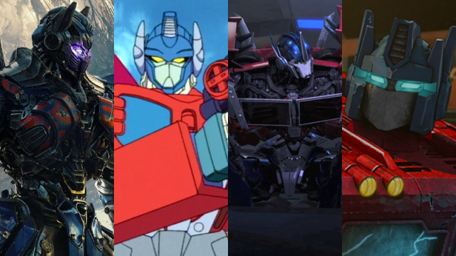
There’s plenty of Primes to celebrate with Prime Day this week — perhaps even a Primal or two — but we should never forget the greatest among them all that inspired such a celebration, even more than a multibillion dollar retailer ever could. The one, the only Optimus Prime: or he would be, if there weren’t so damn many of him.
One of the most enduring giant robots in history, over generations Optimus Prime has seen himself re-worked and tweaked for new iterations of cartoons, comics, games, and movies. Some are radical overhauls to his design and form, others changes so minor you have to squint until you realise that they’re technically different. But they’re Primes one and all (’til all are one), so to celebrate this year’s Prime Day shenanigans, we’re ranking some of the most visually distinctive versions of the character to find out who’s scrap and who’s ready to roll out into first place.
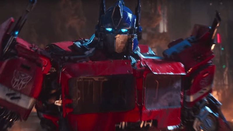
16) Transformers (2007)
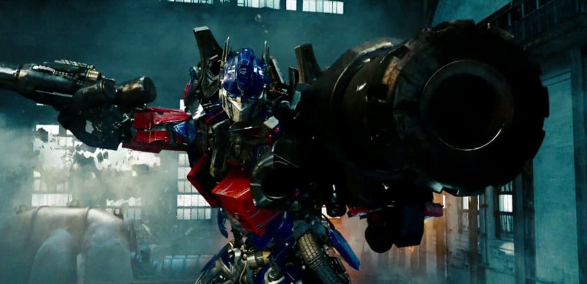
Unsurprisingly, one of the biggest misfires in the series’ entire history — visually, at least; it’s a good reminder that these movies did a huge amount to bring new people to Transformers as a franchise, and, alas, did make an excruciating amount of money — ranks dead last. There’s good ideas here: especially trying to show the mechanical guts of the Transformers more. But it’s just such a visually incoherent mess at times you lose what makes Optimus such an iconic piece of design.
15) Transformers: Age of Extinction (2014)
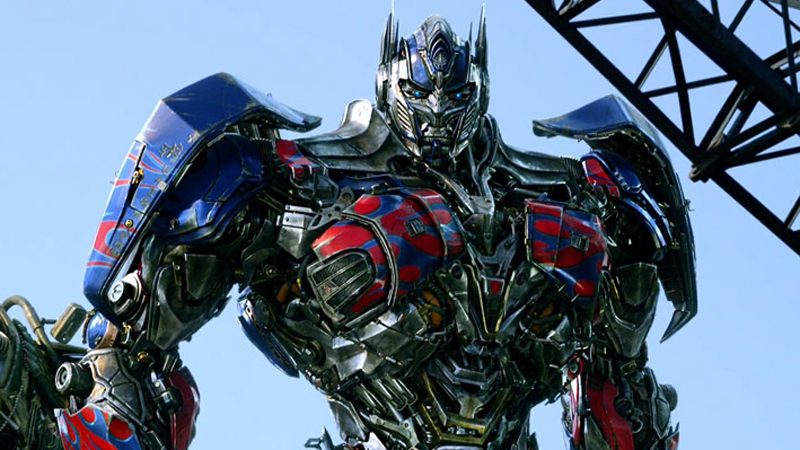
That said, things got better when he was tweaked for the post-trilogy movies, starting with Age of Extinction. The rounder edges and the more defined use of colour brought out what made this movie’s design better. Plus, who doesn’t like a sword and shield sometimes?
14) Energon (2004)
The Unicron trilogy of animated shows — Armada, Energon, and Cybertron — all had some intriguing riffs on Optimus’ core design tenets. Energon Optimus might be the weakest of the three but that’s not to say it’s a bad design; it’s pretty nifty, it’s just thrown off balance a little by the overabundance of white, even if that is a core colour in the character’s palette.
13) Cybertron (2005)
Cybertron Optimus is the ultimate in Go Big or Go Home. There’s a lot going on here, almost bringing him to something Megazord-adjacent rather than Transformer. While it’s very cool to see the character at perhaps his most Super-Robot aesthetically when he gets into Super mode, there’s just one too many elements here taking you away from the classic design hallmarks that make Optimus feel like himself.
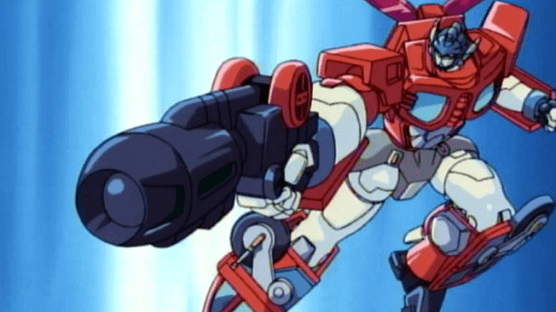
12) Armada (2002)
The first in the Unicron trilogy comes, uh, first out of the three mostly for what it does differently with Optimus’ colour scheme. The yellow higlights here and there are all nice little ways to break up the traditional red and blue, and bringing in more metallics makes him stand out quite nicely. Are the wheels on the shoulders a little much? Perhaps, but it’s a cool look.
11) TransTech (2008)
TransTech was ultimately replaced by Robots in Disguise as the next iteration of the series after Beast Machines, but its designs lived on in the short-lived Fun Publications comics. But it it makes sense that this Optimus, then, has a lot of shape-similarities to Optimus Primal, even if they were two very distinct characters. The big shoulders and chest, the massive arms, there’s definitely some monkey business going on here, and it kind of works.
10) Animated (2007)
Transformers Animated has a really cool aesthetic, and there’s a lot of that here in this version of Optimus — the very cartoony shapes, the curvy legs, the “heroic” proportions. It’s different, and fun! But I’m sorry, I cannot help but shudder every time I look at his unmasked face. It’s a little better with the mask on, but still.
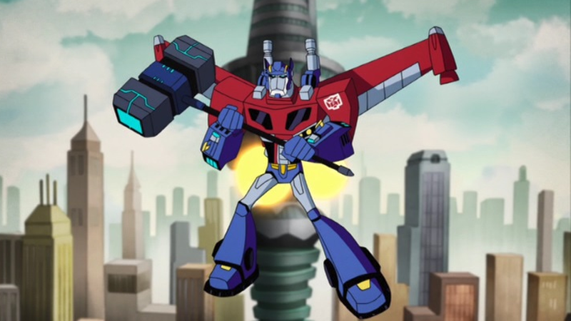
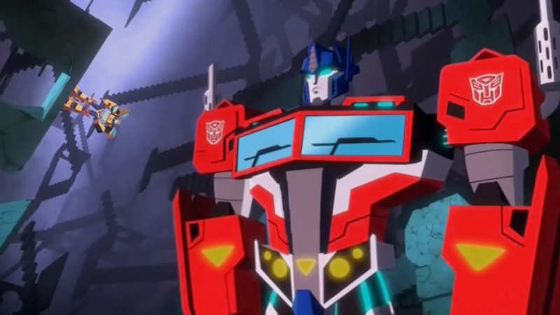
9) Prime (2010)
Now, this is basically just the movie design, right? However, in being made for a kid’s animated series, it takes that design and simplifies it further — making it ultimately a stronger version of it, because what made that design so messy in the first place was, well… all the mess. Smooth that out, give him the rounder shoulders of the Last Knight style design, and bring in some brighter colours, and you make for a pretty cool Prime.
8) Shattered Glass
What if Optimus Prime was so evil he was black and purple? Well… honestly, he’d look pretty good. Shattered Glass’ alt-universe evil Prime might look, from a design standpoint, like a pretty basic Optimus. But it cannot be understated just how striking, and fun, it is to see your brain thrown off seeing that design in such a radically different set of colours.
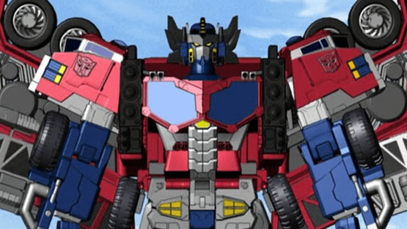
7) Robots in Disguise (2015)
An evolution of Prime’s design, this three-years-later look for Optimus brings him a little closer to the traditional blocky shapes we associate with the character’s silhouette. The black elements incorporated also add a nice, subtle bit of differentiation to other designs, echoing other aspects of the “Aligned” continuity era for the character.
6) Robots in Disguise (2001)
The first major reboot in Transformers continuity brought with it some pretty radical design changes for iconic characters, Optimus included. And woo, he is a big boy. This is a very, very chunky design, but chunky in a different way compared to the classically boxy look of Gen 1 — he’s bulked up all around, and the reduction of the blue in his colour palette along the way is a similarly striking change up. It’s different, but it’s good.
5) War for Cybertron (2020)
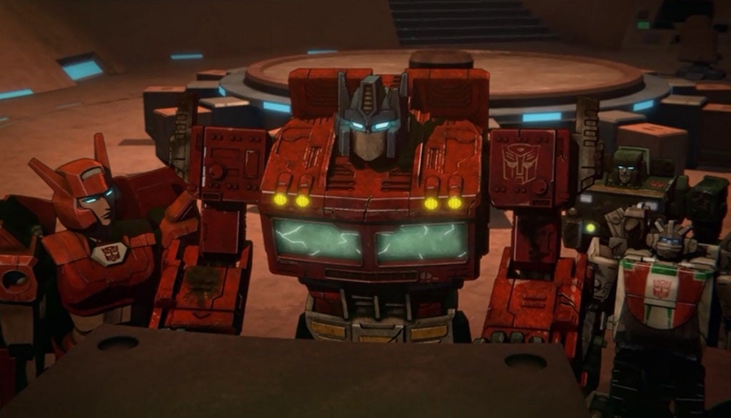
Although the War for Cybertron games came well before it, the Netflix animated riff on the War for Cybertron toyline gave us a version of Optimus that is essentially what most Transformers fans always want out of an Optimus Prime redesign: the classic look, with modern detailing. Does it make sense that a pre-Earth Optimus just looks like the version of him that transforms into a truck? Maybe not. But it’s G1 with some modern greebling, and that’s always going to go down well.
4) Cyberverse (2018)
Similarly, Cyberverse’s Prime takes what works best about the more recent animated iterations of the character — overexaggerated shapes, bright, poppy colour schemes — and merges them with a pretty faithful take on the G1 era design. It’s not 1:1, but it’s a best of both worlds kind of deal.
3) War for Cybertron (2010)
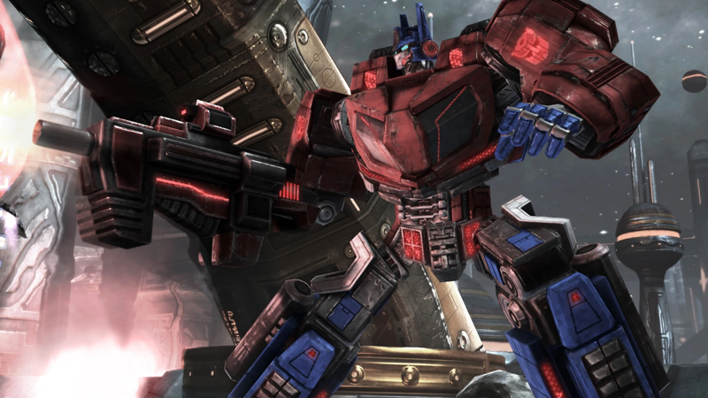
Now see, this is a good pre-Truck version of Optimus. Familiar but different enough so that he’s got a uniquely Cybertronian vehicle mode, the star of War for Cybertron and then Fall of Cybertron has enough classic elements but trades the harsh square lines of G1 for something smooth and rounded, and altogether bulkier. It makes sense, given the context of Cybertron and the war tearing it apart, that he doesn’t yet look like we’d come to know him when he lands on Earth.
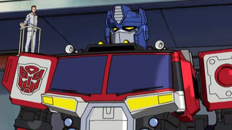
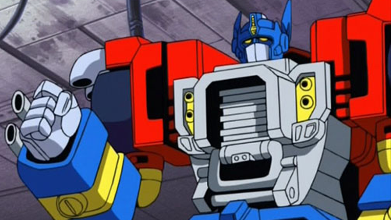
2) Generation 1 (1984)
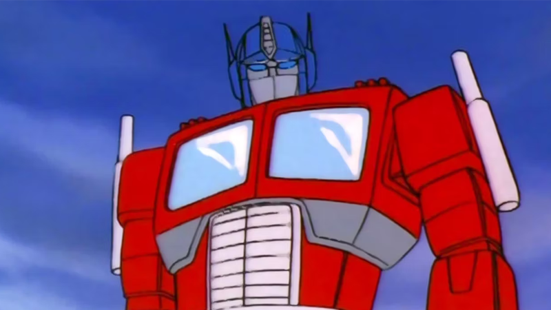
Look… I mean, what do you say? It’s Optimus Prime. It’s the design you always have to come back to for comparison, and is iconic for a reason. We’ve had tweaks and updates over the years, but it’s still pretty much that same look we fell in love with decades ago. And yet…
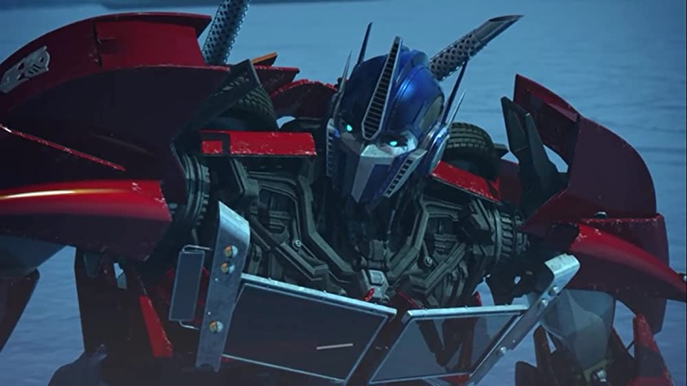
1) Bumblebee (2018)
… Can we go one better? This might be controversial, considering what makes Bumblebee’s version of Optimus work so well in the first place relies on the excellence of the G1 design. But in terms of marrying what the Transformers movie continuity wanted to do with Transformers aesthetics — making them something that looked real and mechanical, and a sentient pile of moving, spinning parts — and the classic look of G1 that fans craved? This is about as perfect an attempt as you can make. It’s the classic look for a modern era, through and through — and a downright shame we never got to see more of it.