
This article is sponsored by Samsung.
It’s never been an easier time to pick up a pen and start putting your art out there. With platforms like Cara picking up steam, the creative networks for artists to discover and be inspired by one another are at an all-time high.
Just recently, we partnered with Samsung to host an exciting art competition to use their Samsung Galaxy Tab S9 FE Series, where we picked out three Aussie artists who have a unique approach to creativity. Emma Northridge was one of our first winners from the competition, whose work will appear on our website alongside two other artists.
Emma’s art blends physical and digital art together, using scanners to print out t-shirts and design zine covers. We asked them about their passion for zine design, how printing out their own DIY t-shirts helped them create a community of music fans, and how they own their mistakes when creating art.
Could you describe the piece you submitted to the competition and what inspired it?
The piece I submitted is a collage of (unsuccessful) scratchy cards that I scanned on my printer and edited digitally. I included the words ‘my luck is gonna change’ to represent hope and optimism in the face of bad odds and prior failure. Initially, I was inspired by the bold graphics of scratchy cards and intended to create a background image for future zines or posters, but a deeper meaning emerged as I created the piece, so I added the text.
When did you first hear about Zines, and why did it interest you?
I first discovered zines in online fandom spaces, as I saw a group of fans create a zine inspired by a My Chemical Romance album. I loved the way this medium combined art and text, and as I explored more in this field, I was inspired by the vast range of topics and formats explored in zines.
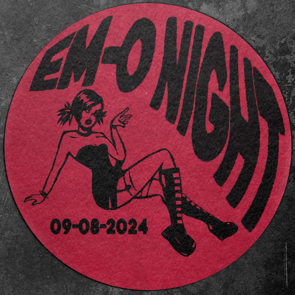
I also gained an appreciation for the use of zines in activist spaces, and the overlap of music and activism in the Riot Grrl scene was particularly inspiring to me, works such as the Riotgrrrl Manifesto inspired both my art as well as the name I adopted for my clothing design work (Riot Ghoul clothing).
What inspired you to design t-shirts?
Being broke inspired me to design t-shirts. Bar a few popular bands — merchandise for many artists I love is hard to come by in Australia, often only available online, and incurs exorbitant shipping fees. I love being able to represent my favourite artists — I find it’s such an easy way to start conversations, and I’ve had friendships start with an ‘I love your shirt’.
Even for the bands whose merch is more readily available, there’s something so cool about wearing something and knowing it’s one of a kind and being able to say ‘Thanks, I made it myself!’ is so gratifying.
What is your hand-printing process? How do you navigate human error?
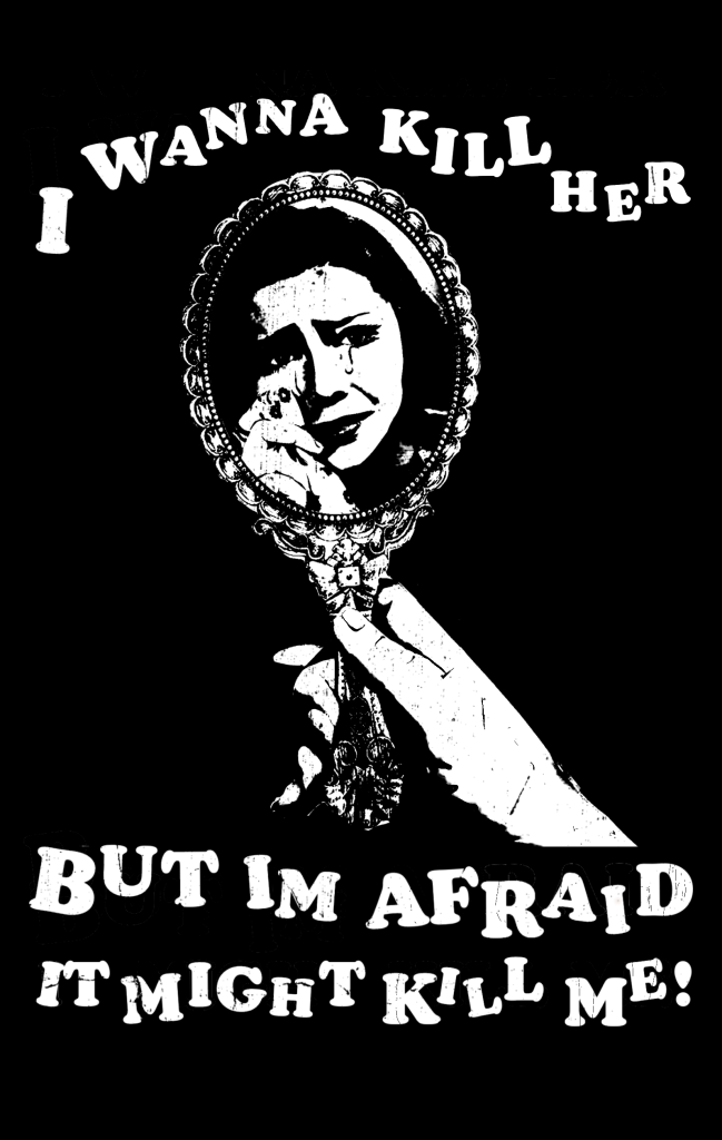
Generally, I design the graphic digitally, either drawing from scratch, or editing images using a threshold tool to ensure images are bold, legible in black and white, and made up of large, easy to cut shapes. Then, I invert the design, print it out and cut out the sections I want painted on the shirt to create a stencil.
If I intend to reuse the stencil, I’ll tape the printout behind an acetate sheet and cut it out of that. But usually, I just cut straight out of the paper. I then tape the stencil to a shirt and use a sponge to print the block shapes onto the shirt. This usually requires a few layers. Then, I’ll remove the stencil and hand-paint additional details, and clean up the design. Typically, I use white fabric paint on a black shirt, so I’ll use black paint to clean up the edges. Once the design dries, I cure it by ironing over the paint, which makes the shirt machine-washable.
I don’t have a specific process to navigate human error, rather, I accept it as a reality of my process and manage it when it occurs. Once paint touches the fabric, it’s pretty much impossible to completely remove it, especially when working on white fabric. If a mistake compromises the overall appearance and legibility of the design, I try my best to paint over it with a paint matching the shirt colour. However, my designs are heavily inspired by the do-it-yourself ethos of punk culture, and I think imperfect designs have more character and better suit the overall aesthetic I aim for.
What modern design techniques have you used to create the vintage aesthetic?
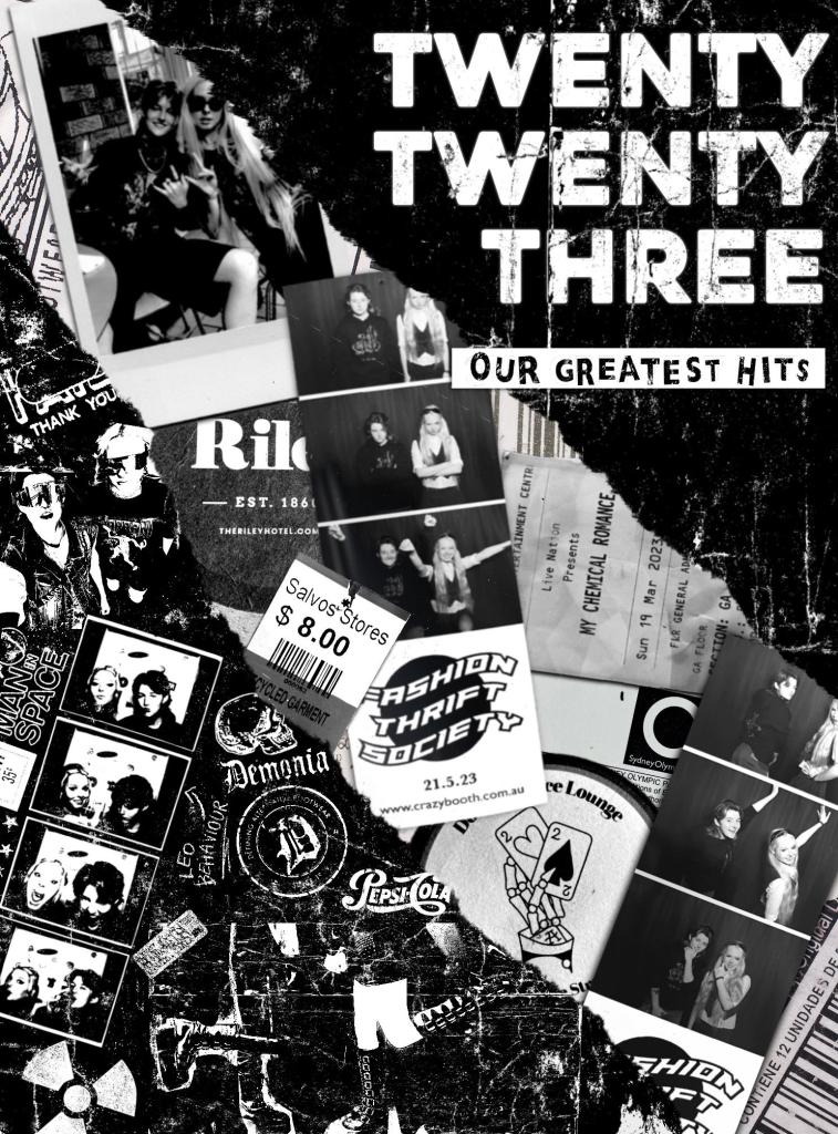
I use Photoshop and Procreate to replicate older techniques used in zines. I either scan or photograph my paper cutouts, and apply filters to replicate a high-contrast Xerox scan. I use threshold tools and gradient maps, alongside texture overlays to add grain. In my zines, I’ve used photobooth strips and polaroids, which add to the over vintage aesthetic, and use royalty-free image banks to add elements such as film strips, and add photos to the cells, and newspaper archives to add relevant text and make pages a bit more interesting. While I enjoy using physical collage elements as much as possible, I also use elements such as ripped and crumpled paper textures to replicate this look when I don’t have access to a printer/scanner.
How does your music taste translate into your art?
Much of my clothing design is directly inspired by music, featuring lyrics from my favourite artists alongside graphics I feel are relevant. Beyond this, much of the music I enjoy has roots in punk scenes, and the DIY ethos behind this is reflected in my low-budget, and often low-tech, processes. I also design clothing aside from the graphic tees, and while my designs often outpace my skills with a sewing machine, many of these designs are inspired by Vivienne Westwood, an icon in punk fashion, as well as the style of artists whose music I love, such as Courtney Love.
What are your thoughts on the future of digital art?
I think it’s a scary time to be a digital artist, given the rise of AI ‘art’. While I can appreciate AI’s use in some contexts, I’ve seen far too many artists’ work be stolen and replicated by AI systems with no regard for the hours of hard work that went into their art. I think it’s sad to see so many companies favour AI ‘art’ rather than commissioning actual, human artists. An AI engine doesn’t have a moral compass like a human does.
While humans are by no means perfect, the ability to create life-like images of just about anything represents a really scary prospect. I think the use of AI needs to be restricted or limited in a way so that it can benefit society, rather than harm artists’ livelihoods and be used for malicious purposes.
What advice would you give to a starting artist?
The more you create, the better you’ll get. You might finish a piece and absolutely hate it, want to burn it and throw your art supplies in a bin, but even if the piece is truly awful (which it probably isn’t, artists tend to be very self-critical), you’ve still strengthened your skills, practised artistic techniques, and gained a better understanding of what you like and dislike in your work by creating a model for what you don’t want to do. There are so many different forms of art out there — even if you can’t draw a stick figure, you could still be an incredible artist. Find something that inspires you and everything else will fall into place.
You can check out more of Emma’s work on our website, alongside our other winners.